
手順の流れを示す時に使うステップのデザインは、画像で作ってしまうことがありますが、更新の度のメンテナンスが結構面倒です。
最近はCSSのflex と、擬似要素のbeforeとafterを使えば、結構簡単です。
今回の記事は、実際にWordPressのループと絡めて使ったデザインで、裏側の関数の記述は抜きにしたものです。
HTMLとCSSのコピペだけでできるので、この記事を参考によかったら使ってください。

それでは早速ご覧ください。
目次
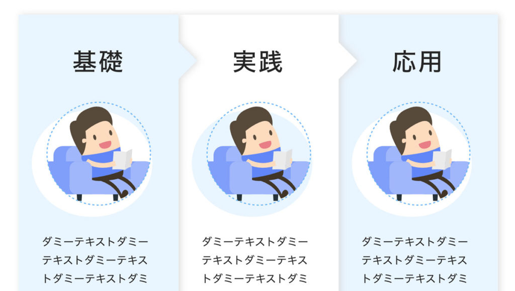
デザインサンプル
早速、デザインサンプルです。
SANGOの記事部分のwidthが最大815px程度なので、ちょっと縦に長くなっています。
-
基礎
![基礎]()
ダミーテキストダミーテキストダミーテキストダミーテキストダミーテキストダミーテキストダミーテキストダミーテキストダミーテキスト
-
実践
![実践]()
ダミーテキストダミーテキストダミーテキストダミーテキストダミーテキストダミーテキストダミーテキストダミーテキストダミーテキスト
-
応用
![応用]()
ダミーテキストダミーテキストダミーテキストダミーテキストダミーテキストダミーテキストダミーテキストダミーテキストダミーテキスト

3段階の基礎・実践・応用のステップで、PCでは左から右に配置され、スマホの場合は縦並びになります。
ちょうどいいwidthの設置サイズは1000px前後です。
コピペ用コード
コピペ用コードです。HTMLは設置したいところにコピペして、CSSもそのままコピペすれば利用できます。
コードを表示する
<div class="second_block">
	<div class="second_inner">
		<div class="second_chart">
			<ul>
				<li>
					<h3>基礎</h3>
					<div class="liimg"><img src="https://dubdesign.net/wp-content/uploads/2021/07/circleicon-1.svg" alt="基礎"></div>
					<p>ダミーテキストダミーテキストダミーテキストダミーテキストダミーテキストダミーテキストダミーテキストダミーテキストダミーテキスト</p>
					<div class="threecircle">
						<div class="circleblue"></div>
						<div></div>
						<div></div>
					</div>
				</li>
				<li>
					<h3>実践</h3>
					<div class="liimg bgcolor"><img src="https://dubdesign.net/wp-content/uploads/2021/07/circleicon-1.svg" alt="実践"></div>
					<p>ダミーテキストダミーテキストダミーテキストダミーテキストダミーテキストダミーテキストダミーテキストダミーテキストダミーテキスト</p>
					<div class="threecircle">
						<div></div>
						<div class="circleblue"></div>
						<div></div>
					</div>
				</li>
				<li>
					<h3>応用</h3>
					<div class="liimg"><img src="https://dubdesign.net/wp-content/uploads/2021/07/circleicon-1.svg" alt="応用"></div>
					<p>ダミーテキストダミーテキストダミーテキストダミーテキストダミーテキストダミーテキストダミーテキストダミーテキストダミーテキスト</p>
					<div class="threecircle">
						<div></div>
						<div></div>
						<div class="circleblue"></div>
					</div>
				</li>
			</ul>
		</div>
	</div>
</div>.second_block {
display: block;
position: relative;
padding: 0 0 80px;
}
.second_inner {
max-width: 1100px;
width: 100%;
margin: 50px auto 0;
}
.second_midashi {
text-align: center;
margin-bottom: 60px;
}
.second_midashi h2 {
display: inline-block;
padding: 0px 26px 8px;
border-bottom: dotted 3px #1565C0;
margin-bottom: 25px;
}
.second_midashi p {
font-size: 1rem;
letter-spacing: 0.02rem;
line-height: 1.8rem;
}
.second_chart ul {
display: flex;
justify-content: center;
flex-wrap: nowrap;
position: relative;
width: 100%;
margin: 0;
padding: 0;
list-style: none;
border: none;
}
.second_chart ul li {
width: 33%;
background: #ddd;
filter: drop-shadow(0px 1px 12px #ddd);
}
.second_chart ul li {
width: 33%;
background: #E8F5FF;
filter: drop-shadow(3px 0px 5px #ddd);
display: flex;
flex-flow: column;
padding: 25px 30px 45px;
position: relative
}
.second_chart ul li:first-child {
z-index: 3;
}
.second_chart ul li:nth-child(2) {
z-index: 2;
background: #FFF;
}
.second_chart ul li h3 {
text-align: center;
font-size: 2.3rem;
letter-spacing: 0.18rem;
font-weight: 500;
margin: 20px 0 30px;
padding: 0;
}
.second_chart ul li .liimg {
padding: 0 10px;
margin-bottom: 40px;
position: relative;
text-align: center;
}
.second_chart ul li .liimg:after {
content: "";
width: 100%;
height: 100%;
background: #FFF;
position: absolute;
bottom: -15px;
right: 10px;
border-radius: 50%;
z-index: -1;
}
.second_chart ul li .liimg.bgcolor:after {
background: #e8f5ff;
}
.second_chart ul li p {
font-size: 1rem;
letter-spacing: 0.02rem;
line-height: 1.8rem;
margin-bottom: 30px;
padding-left: 5px;
}
.threecircle {
text-align: center;
position: absolute;
display: flex;
justify-content: center;
flex-wrap: wrap;
bottom: 30px;
left: 0;
margin: 0 auto;
right: 0;
}
.threecircle div {
width: 25px;
height: 25px;
border-radius: 50%;
margin: 0 5px;
border: solid 1px #6BB6FF;
}
.circleblue {
background: #6BB6FF;
}
.second_chart ul li:first-child:after {
content: "";
width: 0;
height: 0;
border-top: 30px solid transparent;
border-right: 30px solid transparent;
border-bottom: 30px solid transparent;
border-left: 30px solid #e8f5ff;
top: 40px;
position: absolute;
right: -58px;
}
.second_chart ul li:nth-child(2):after {
content: "";
width: 0;
height: 0;
border-top: 30px solid transparent;
border-right: 30px solid transparent;
border-bottom: 30px solid transparent;
border-left: 30px solid #FFF;
top: 40px;
position: absolute;
right: -58px;
}
/* 2nd */
@media screen and (max-width: 767px) {
/* (ここにモバイル用スタイルを記述) */
.second_inner {
padding: 0 15px;
}
.second_midashi p {
text-align: left;
}
.second_midashi p br {
display: none;
}
.second_chart ul {
flex-flow: column;
}
.second_chart ul li {
width: 100%;
padding-left: 30px;
padding-right: 30px;
}
.second_chart ul li h3 {
margin-bottom: 30px;
}
.second_chart ul li:first-child:after {
top: 99.5%;
position: absolute;
right: 50%;
left: 50%;
margin: 0 auto;
border-top: 30px solid #e8f5ff;
border-right: 30px solid transparent;
border-bottom: 30px solid transparent;
border-left: 30px solid transparent;
transform: translate(-50%, 0px);
}
.second_chart ul li:nth-child(2):after {
top: 99.5%;
position: absolute;
right: 50%;
left: 50%;
margin: 0 auto;
border-top: 30px solid #FFF;
border-right: 30px solid transparent;
border-bottom: 30px solid transparent;
border-left: 30px solid transparent;
transform: translate(-50%, 0px);
}
}ちょっとしたコードの解説
ちょっとしたコードの解説です。主にCSSのコード中心です。
カスタマイズしたい方はこちらもご覧ください。
CSS:first-childとnth-child(2)
そのままCSSで指定しない状態だと、3つのカードの重なりは一番右が上にくり形になってしまいます。
そこで、CSSのz-index で重なり順を指定します。
.second_chart ul li:first-child { z-index: 3; } .second_chart ul li:nth-child(2) { z-index: 2;} がその指定順です。
first-childが一番左の li にあたり、nth-child(2) が左から2番目の li に対してz-indexを指定してます。
デザインサンプルは3つのステップ数ですが、ステップをもっと増やす場合はこの辺のCSSを追加するなりすればOKです。
CSS:first-child:afterとfirst-child:before
矢印の方向をfirst-child:afterとfirst-child:before で指定しています。
PCとスマホで矢印の方向が異なるので、border-XXX の部分をいじると矢印の方向を変えることができます。