
この記事では、カードをクリックしたらカードからモーダルを拡大縮小して表示する方法とコードについて解説します。
具体的には、HTML、CSS、JavaScriptを使用して、ユーザーがカードをクリックすると関連情報を表示するモーダルウィンドウが中央にアニメーションで表示されるプロセスです。
実際のサンプルもあるので、ぜひ最後までご覧ください。
目次
getBoundingClientRect();
JavaScriptのgetBoundingClientRect() は、要素の寸法とそのビューポートにおける位置を含むDOMRectオブジェクトを返します。
このメソッドが返すオブジェクトは、top, right, bottom, left, width, そして height のプロパティを含んでいます。これらの値はピクセル単位で、要素の境界ボックスを基に計算されます。
この記事のコードとの関連性
この記事のJavaScriptコードでは、ユーザーがカードをクリックしたときにそのカードの現在位置を特定するために getBoundingClientRect() を使用しています。

例えば、以下のコードセグメントを見てみましょう:
var rect = currentCard.getBoundingClientRect();この行では、クリックされたカードの currentCard から getBoundingClientRect() を呼び出し、カードの位置とサイズの情報を取得しています。この情報は、モーダルウィンドウのサイズと位置を設定するのに使っています。
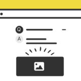
カードをクリックしたらモーダルを表示するサンプル
早速サンプルです。
以下に4つのカードリンクが表示されていますが、クリックするとカードの位置から拡大しながらモーダルが表示され、そのカードに応じた内容が表示。そして、モーダルを閉じる時はそのカードの位置に戻るようにして非表示になります。
-
![Thumbnail 1]()
Article Title 1
-
![Thumbnail 2]()
Article Title 2
-
![Thumbnail 3]()
Article Title 3
-
![Thumbnail 4]()
Article Title 4

モーダル内の「続きを見る」のリンクURLはダミーなのでご勘弁を・・。
実装の手順と方法

コードの詳細の前に、実装の手順と方法について解説していきます。
はじめにリンクカードを表示させたい位置にHTMLを記述します。
<ul class="link-card_block">
<li class="link-card" data-title="Article Title 1" data-summary="Summary of article 1..." data-link="https://example.com/page-1" data-image="https://dubdesign.net/wp-content/uploads/2024/03/keihi-520x300.jpg">
    <img src="https://dubdesign.net/wp-content/uploads/2024/03/keihi-520x300.jpg" alt="Thumbnail 1">
    <div class="link-card_text"><p>Article Title 1</p></div>
</li>
<li class="link-card" data-title="Article Title 2" data-summary="インハウスでDTP・WEBデザイン、マークアップ、SEO対策、サイト構築と広めにやっています。最近はプロダクトデザインの仕事がメインです。" data-link="https://example.com/page-2" data-image="https://dubdesign.net/wp-content/uploads/2024/03/keihi-520x300.jpg">
    <img src="https://dubdesign.net/wp-content/uploads/2024/03/keihi-520x300.jpg" alt="Thumbnail 2">
    <div class="link-card_text"><p>Article Title 2</p></div>
</li>
<li class="link-card" data-title="Article Title 3" data-summary="Summary of article 3..." data-link="https://example.com/page-2" data-image="https://dubdesign.net/wp-content/uploads/2024/03/keihi-520x300.jpg">
    <img src="https://dubdesign.net/wp-content/uploads/2024/03/keihi-520x300.jpg" alt="Thumbnail 3">
    <div class="link-card_text"><p>Article Title 3</p></div>
</li>
<li class="link-card" data-title="Article Title 4" data-summary="Summary of article 4..." data-link="https://example.com/page-2" data-image="https://dubdesign.net/wp-content/uploads/2024/03/keihi-520x300.jpg">
    <img src="https://dubdesign.net/wp-content/uploads/2024/03/keihi-520x300.jpg" alt="Thumbnail 4">
    <div class="link-card_text"><p>Article Title 4</p></div>
</li>
<!-- Repeat for other cards -->

<!-- Modal Structure -->
<div id="modal" class="modal">
    <div id="modal-content" class="modal-content">
        <span id="modal-close" class="close">×</span>
        <div class="modal-contentInnerTop"><img id="modal-image" src="" alt="Selected Thumbnail">
        <p id="modal-title"></p>
        <p id="modal-summary"></p></div>
        <div class="modal-contentInnerBottom"><a id="modal-link" href="#">続きを見る</a></div>
    </div>
    <div id="modal-overlay" class="modal-overlay"></div>
</div></ul>次に、JavaScriptのコードを記述します。
コードは <body>〜</body>で、</body> の閉じタグ(クロージングタグ)の前に記述しましょう。
document.addEventListener('DOMContentLoaded', function () {
    // ページの読み込みが完了したら実行
    var cards = document.querySelectorAll('.link-card'); // '.link-card'クラスを持つ要素をすべて選択
    var modal = document.getElementById('modal'); // モーダルの要素を取得
    var modalContent = document.getElementById('modal-content'); // モーダルのコンテンツ部分を取得
    var closeModal = document.getElementById('modal-close'); // モーダルを閉じるボタンを取得
    var overlay = document.getElementById('modal-overlay'); // モーダルの背景部分を取得

    var initialRect = null; // クリックされたカードの初期位置とサイズを保存する変数

    cards.forEach(function(card) {
        // 各カードにクリックイベントを設定
        card.addEventListener('click', function() {
            currentCard = card; // 現在クリックされたカードを更新
            initialRect = currentCard.getBoundingClientRect(); // カードの現在の位置とサイズを取得

            // データ属性に基づいて画像、タイトル、サマリー、リンクを設定
            document.getElementById('modal-image').src = currentCard.getAttribute('data-image');
            document.getElementById('modal-title').textContent = currentCard.getAttribute('data-title');
            document.getElementById('modal-summary').textContent = currentCard.getAttribute('data-summary');
            document.getElementById('modal-link').href = currentCard.getAttribute('data-link');

            // モーダルコンテンツの初期位置とサイズをカードに合わせて設定
            modalContent.style.position = 'fixed';
            modalContent.style.width = initialRect.width + 'px';
            modalContent.style.height = initialRect.height + 'px';
            modalContent.style.top = initialRect.top + 'px';
            modalContent.style.left = initialRect.left + 'px';
            modalContent.style.transform = 'translate(0, 0) scale(1)';
            modalContent.style.opacity = 1;

            // モーダルとオーバーレイを表示
            modal.style.display = 'flex';
            overlay.style.display = 'block';
            overlay.style.opacity = 1;

            setTimeout(function() {
                // モーダルの位置とサイズをビューポートの中心にアニメーションで移動
                modalContent.style.transition = 'transform 0.5s ease-in-out, top 0.5s ease-in-out, left 0.5s ease-in-out, width 0.5s ease-in-out, height 0.5s ease-in-out, opacity 0.5s ease-in-out';
                modalContent.style.width = '80%'; // 目標のサイズに変更
                modalContent.style.height = 'fit-content'; // 高さを内容に合わせる
                modalContent.style.top = '50%'; // 垂直中央に
                modalContent.style.left = '50%'; // 水平中央に
                modalContent.style.transform = 'translate(-50%, -50%) scale(1)';
            }, 10);
        });
    });

    function closeHandler() {
        // モーダルを閉じる際のアニメーション
        modalContent.style.transition = 'transform 0.5s ease-in-out, top 0.5s ease-in-out, left 0.5s ease-in-out, width 0.5s ease-in-out, height 0.5s ease-in-out, opacity 0.5s ease-in-out';
        modalContent.style.width = initialRect.width + 'px';
        modalContent.style.height = initialRect.height + 'px';
        modalContent.style.top = initialRect.top + 'px';
        modalContent.style.left = initialRect.left + 'px';
        modalContent.style.transform = 'translate(0, 0) scale(0)';
        modalContent.style.opacity = 0;

        setTimeout(function() {
            // モーダルとオーバーレイを非表示に
            modal.style.display = 'none';
            overlay.style.display = 'none';
            modalContent.style.transition = 'none';
            modalContent.style.transform = 'translate(-50%, -50%) scale(1)';
            modalContent.style.opacity = 1;
        }, 500);
    }

    closeModal.addEventListener('click', closeHandler); // 閉じるボタンのイベントリスナー
    overlay.addEventListener('click', closeHandler); // オーバーレイをクリックしたときも閉じる
});最後にCSSで見た目を整えて完了です。
ul.link-card_block {
    display: flex;
    justify-content: flex-start;
    gap: 40px;
    flex-wrap: wrap;
}
.link-card {
    background: #fff;
    box-shadow: 0 0 3px 0 rgba(0, 0, 0, 0.12), 0 2px 3px 0 rgba(0, 0, 0, 0.22);
    cursor: pointer;
    transition: 0.2s ease-in-out;
    width: 45%;
    box-sizing: border-box;
    display: flex;
    flex-direction: column;
    padding: 0 !important;
}
.link-card:hover {
    box-shadow: 0 15px 30px -5px rgba(0, 0, 0, 0.15), 0 0 5px rgba(0, 0, 0, 0.1);
    transform: translateY(-4px);
}
.link-card img {
    width: 100%;
}
.link-card_text {
    padding: 12px 16px;
}
.link-card_text p {
    padding: 0;
    margin: 0;
    font-weight: 600;
    color: #313131;
}

.modal {
    display: none;
    position: fixed;
    top: 0;
    left: 0;
    width: 100%;
    height: 100%;
    align-items: center;
    justify-content: center;
    z-index: 1050;
    overflow: hidden;
}

.modal-overlay {
    position: absolute;
    top: 0;
    left: 0;
    width: 100%;
    height: 100%;
    background: rgba(0, 0, 0, 0.5);
    opacity: 0;
    transition: opacity 0.5s ease;
    z-index:9;
}

.modal-content {
    position: absolute;
    top: 50%;
    left: 50%;
    transform: translate(-50%, -50%) scale(0);
    width: 80%;
    max-width: 600px;
    height: auto;
    background: #fff;
    border-radius: 8px;
    box-shadow: 0 4px 6px rgba(0,0,0,0.1);
    transition: transform 0.5s ease;
    z-index: 10;
    display: flex;
    flex-direction: column;
   max-height: 80%;
   gap: 15px;
}
#modal-image {
    width: 100%;
}
.close {
    position: absolute;
    top: -11px;
    right: -11px;
    cursor: pointer;
    font-size: 1.3em;
    color: #555;
    z-index: 20;
    display: flex;
    background: #f9f9f9;
    width: 38px;
    height: 38px;
    justify-content: center;
    align-items: center;
    border-radius: 9999px;
    border: solid 1px #ddd;
    transition: 0.3s ease-in-out;
    line-height: 1;
    padding: 0;
}
.close:hover {
    opacity: 0.8;
}
.modal-contentInnerTop {
    display: flex;
    flex-direction: column;
    overflow: hidden;
    border-radius: 8px 8px 0 0;
    gap: 8px;
}
.modal-contentInnerTop p {
    margin: 0;
    padding-left: 20px;
    padding-right: 20px;
}
.modal-contentInnerBottom {
    display: flex;
    justify-content: center;
    padding: 12px 0;
    background: #f9f9f9;
    border-radius: 0 0 8px 8px;
}
#modal-link {
    background: #fff;
    color: #6bb6ff;
    width: 240px;
    display: flex;
    justify-content: center;
    padding: 7px 0 5px;
    font-weight: 600;
    border-radius: 4px;
    text-decoration: none;
    border: solid 1px #6bb6ff;
    position: relative;
}
#modal-link:after {
    right: 14px;
    opacity: 0.6;
    font-family: "Font Awesome 5 Free";
    content: "\f105";
    font-weight: 900;
    position: absolute;
}
#modal-link:hover {
    background: #6bb6ff;
    color: #fff;
    opacity: 0.8;
}
#modal-title {
    font-weight: 600;
    font-size: 1.2rem;
    color: #313131;
}
#modal-summary {
    color: #707070;
    font-size: 0.9rem;
}
ざっくりとしたコードの解説
コードは、HTML・JavaScript・CSSの3種類です。
HTMLでカードとモーダルで表示する内容を整えて、JavaScriptでアニメーションと挙動を作るイメージ。そして、CSSで「レイアウトと見た目を整える」です。
この3つのコードについて、解説していきます。
HTML
HTMLは、動的なモーダルウィンドウを表示するための構造で、大きく分けて「カードリスト」と「モーダル」の2つで構成されています。
<ul class="link-card_block">
<li class="link-card" data-title="Article Title 1" data-summary="Summary of article 1..." data-link="https://example.com/page-1" data-image="https://dubdesign.net/wp-content/uploads/2024/03/keihi-520x300.jpg">
    <img src="https://dubdesign.net/wp-content/uploads/2024/03/keihi-520x300.jpg" alt="Thumbnail 1">
    <div class="link-card_text"><p>Article Title 1</p></div>
</li>
<li class="link-card" data-title="Article Title 2" data-summary="インハウスでDTP・WEBデザイン、マークアップ、SEO対策、サイト構築と広めにやっています。最近はプロダクトデザインの仕事がメインです。" data-link="https://example.com/page-2" data-image="https://dubdesign.net/wp-content/uploads/2024/03/keihi-520x300.jpg">
    <img src="https://dubdesign.net/wp-content/uploads/2024/03/keihi-520x300.jpg" alt="Thumbnail 2">
    <div class="link-card_text"><p>Article Title 2</p></div>
</li>
<li class="link-card" data-title="Article Title 3" data-summary="Summary of article 3..." data-link="https://example.com/page-2" data-image="https://dubdesign.net/wp-content/uploads/2024/03/keihi-520x300.jpg">
    <img src="https://dubdesign.net/wp-content/uploads/2024/03/keihi-520x300.jpg" alt="Thumbnail 3">
    <div class="link-card_text"><p>Article Title 3</p></div>
</li>
<li class="link-card" data-title="Article Title 4" data-summary="Summary of article 4..." data-link="https://example.com/page-2" data-image="https://dubdesign.net/wp-content/uploads/2024/03/keihi-520x300.jpg">
    <img src="https://dubdesign.net/wp-content/uploads/2024/03/keihi-520x300.jpg" alt="Thumbnail 4">
    <div class="link-card_text"><p>Article Title 4</p></div>
</li>
<!-- Repeat for other cards -->

<!-- Modal Structure -->
<div id="modal" class="modal">
    <div id="modal-content" class="modal-content">
        <span id="modal-close" class="close">×</span>
        <div class="modal-contentInnerTop"><img id="modal-image" src="" alt="Selected Thumbnail">
        <p id="modal-title"></p>
        <p id="modal-summary"></p></div>
        <div class="modal-contentInnerBottom"><a id="modal-link" href="#">続きを見る</a></div>
    </div>
    <div id="modal-overlay" class="modal-overlay"></div>
</div></ul>- <ul class=”link-card_block”>: このul要素は、記事のカードを含むコンテナとして機能します。カードはリストの形式で整理されており、視覚的に一覧表示されます。
- <li class=”link-card” …>: 各li要素は個々の記事を表します。カードはクリック可能で、クリックすると関連するモーダルウィンドウが表示されるようにJavaScriptと連動しています。data-*属性は、記事のタイトル、要約、リンク、画像のURLを保持し、スクリプトで動的にモーダルに内容を渡すために使用されます。
- <div id=”modal” class=”modal”>: モーダルウィンドウ全体を包含するコンテナです。このコンテナは通常は非表示で、特定のカードがクリックされたときに表示されます。
- <div id=”modal-content” class=”modal-content”>: モーダルウィンドウの内容を格納する部分です。テキスト情報や画像など、動的に更新される要素が含まれます。
- <span id=”modal-close” class=”close”>: モーダルを閉じるためのクローズボタンです。クリックするとモーダルウィンドウが閉じます。
- <div class=”modal-contentInnerTop”>と<div class=”modal-contentInnerBottom”>: モーダルの内部をさらに区分けして、画像とテキスト(タイトルと要約)、そしてアクションリンクを整理して表示します。
- <div id=”modal-overlay” class=”modal-overlay”>: モーダルの背景オーバーレイで、モーダルが開いている間は画面の残りの部分を暗くします。これにより、ユーザーの注意がモーダルコンテンツに集中しやすくなります。
JavaScript
JavaScriptのコードでは、ウェブページ内の複数のカードから、ユーザーのインタラクションに応じてモーダルウィンドウを動的に表示する機能を実装しています。
各カードがクリックされると、そのカードに関連付けられた情報をモーダルウィンドウに表示し、中央にアニメーションで移動させる処理が含まれています。
document.addEventListener('DOMContentLoaded', function () {
    // ページの読み込みが完了したら実行
    var cards = document.querySelectorAll('.link-card'); // '.link-card'クラスを持つ要素をすべて選択
    var modal = document.getElementById('modal'); // モーダルの要素を取得
    var modalContent = document.getElementById('modal-content'); // モーダルのコンテンツ部分を取得
    var closeModal = document.getElementById('modal-close'); // モーダルを閉じるボタンを取得
    var overlay = document.getElementById('modal-overlay'); // モーダルの背景部分を取得

    var initialRect = null; // クリックされたカードの初期位置とサイズを保存する変数

    cards.forEach(function(card) {
        // 各カードにクリックイベントを設定
        card.addEventListener('click', function() {
            currentCard = card; // 現在クリックされたカードを更新
            initialRect = currentCard.getBoundingClientRect(); // カードの現在の位置とサイズを取得

            // データ属性に基づいて画像、タイトル、サマリー、リンクを設定
            document.getElementById('modal-image').src = currentCard.getAttribute('data-image');
            document.getElementById('modal-title').textContent = currentCard.getAttribute('data-title');
            document.getElementById('modal-summary').textContent = currentCard.getAttribute('data-summary');
            document.getElementById('modal-link').href = currentCard.getAttribute('data-link');

            // モーダルコンテンツの初期位置とサイズをカードに合わせて設定
            modalContent.style.position = 'fixed';
            modalContent.style.width = initialRect.width + 'px';
            modalContent.style.height = initialRect.height + 'px';
            modalContent.style.top = initialRect.top + 'px';
            modalContent.style.left = initialRect.left + 'px';
            modalContent.style.transform = 'translate(0, 0) scale(1)';
            modalContent.style.opacity = 1;

            // モーダルとオーバーレイを表示
            modal.style.display = 'flex';
            overlay.style.display = 'block';
            overlay.style.opacity = 1;

            setTimeout(function() {
                // モーダルの位置とサイズをビューポートの中心にアニメーションで移動
                modalContent.style.transition = 'transform 0.5s ease-in-out, top 0.5s ease-in-out, left 0.5s ease-in-out, width 0.5s ease-in-out, height 0.5s ease-in-out, opacity 0.5s ease-in-out';
                modalContent.style.width = '80%'; // 目標のサイズに変更
                modalContent.style.height = 'fit-content'; // 高さを内容に合わせる
                modalContent.style.top = '50%'; // 垂直中央に
                modalContent.style.left = '50%'; // 水平中央に
                modalContent.style.transform = 'translate(-50%, -50%) scale(1)';
            }, 10);
        });
    });

    function closeHandler() {
        // モーダルを閉じる際のアニメーション
        modalContent.style.transition = 'transform 0.5s ease-in-out, top 0.5s ease-in-out, left 0.5s ease-in-out, width 0.5s ease-in-out, height 0.5s ease-in-out, opacity 0.5s ease-in-out';
        modalContent.style.width = initialRect.width + 'px';
        modalContent.style.height = initialRect.height + 'px';
        modalContent.style.top = initialRect.top + 'px';
        modalContent.style.left = initialRect.left + 'px';
        modalContent.style.transform = 'translate(0, 0) scale(0)';
        modalContent.style.opacity = 0;

        setTimeout(function() {
            // モーダルとオーバーレイを非表示に
            modal.style.display = 'none';
            overlay.style.display = 'none';
            modalContent.style.transition = 'none';
            modalContent.style.transform = 'translate(-50%, -50%) scale(1)';
            modalContent.style.opacity = 1;
        }, 500);
    }

    closeModal.addEventListener('click', closeHandler); // 閉じるボタンのイベントリスナー
    overlay.addEventListener('click', closeHandler); // オーバーレイをクリックしたときも閉じる
});- イベントリスナーの設定:DOMContentLoaded イベントを使用して、ページの読み込みが完了した後にスクリプトが実行されるようにしています。これにより、HTML要素がすべて読み込まれた状態でJavaScriptが動作することが保証されます。
- カードの選択とイベントバインディング:.link-card クラスを持つすべての要素(カード)を選択し、それぞれにクリックイベントを設定しています。カードがクリックされると、モーダルウィンドウが表示されるようになっています。
- モーダルの動的内容設定と表示:クリックされたカードのデータ属性から情報を取得し、モーダルウィンドウの内容(画像、タイトル、要約、リンク)を更新します。その後、モーダルを画面の中央にアニメーションで移動させて表示します。
- モーダルのクローズ処理:モーダルを閉じるためのボタンとオーバーレイにイベントリスナーを設定し、クリックされた際にモーダルがアニメーションと共に閉じるようにしています。閉じる際は、モーダルの内容がフェードアウトし、最終的に非表示になります。
詳細の説明はコメントアウトしてるので、一緒にご覧ください。
CSS
CSSでは、リンクカードとモーダルのデザインを定義しています。
ul.link-card_block {
    display: flex;
    justify-content: flex-start;
    gap: 40px;
    flex-wrap: wrap;
}
.link-card {
    background: #fff;
    box-shadow: 0 0 3px 0 rgba(0, 0, 0, 0.12), 0 2px 3px 0 rgba(0, 0, 0, 0.22);
    cursor: pointer;
    transition: 0.2s ease-in-out;
    width: 45%;
    box-sizing: border-box;
    display: flex;
    flex-direction: column;
    padding: 0 !important;
}
.link-card:hover {
    box-shadow: 0 15px 30px -5px rgba(0, 0, 0, 0.15), 0 0 5px rgba(0, 0, 0, 0.1);
    transform: translateY(-4px);
}
.link-card img {
    width: 100%;
}
.link-card_text {
    padding: 12px 16px;
}
.link-card_text p {
    padding: 0;
    margin: 0;
    font-weight: 600;
    color: #313131;
}

.modal {
    display: none;
    position: fixed;
    top: 0;
    left: 0;
    width: 100%;
    height: 100%;
    align-items: center;
    justify-content: center;
    z-index: 1050;
    overflow: hidden;
}

.modal-overlay {
    position: absolute;
    top: 0;
    left: 0;
    width: 100%;
    height: 100%;
    background: rgba(0, 0, 0, 0.5);
    opacity: 0;
    transition: opacity 0.5s ease;
    z-index:9;
}

.modal-content {
    position: absolute;
    top: 50%;
    left: 50%;
    transform: translate(-50%, -50%) scale(0);
    width: 80%;
    max-width: 600px;
    height: auto;
    background: #fff;
    border-radius: 8px;
    box-shadow: 0 4px 6px rgba(0,0,0,0.1);
    transition: transform 0.5s ease;
    z-index: 10;
    display: flex;
    flex-direction: column;
   max-height: 80%;
   gap: 15px;
}
#modal-image {
    width: 100%;
}
.close {
    position: absolute;
    top: -11px;
    right: -11px;
    cursor: pointer;
    font-size: 1.3em;
    color: #555;
    z-index: 20;
    display: flex;
    background: #f9f9f9;
    width: 38px;
    height: 38px;
    justify-content: center;
    align-items: center;
    border-radius: 9999px;
    border: solid 1px #ddd;
    transition: 0.3s ease-in-out;
    line-height: 1;
    padding: 0;
}
.close:hover {
    opacity: 0.8;
}
.modal-contentInnerTop {
    display: flex;
    flex-direction: column;
    overflow: hidden;
    border-radius: 8px 8px 0 0;
    gap: 8px;
}
.modal-contentInnerTop p {
    margin: 0;
    padding-left: 20px;
    padding-right: 20px;
}
.modal-contentInnerBottom {
    display: flex;
    justify-content: center;
    padding: 12px 0;
    background: #f9f9f9;
    border-radius: 0 0 8px 8px;
}
#modal-link {
    background: #fff;
    color: #6bb6ff;
    width: 240px;
    display: flex;
    justify-content: center;
    padding: 7px 0 5px;
    font-weight: 600;
    border-radius: 4px;
    text-decoration: none;
    border: solid 1px #6bb6ff;
    position: relative;
}
#modal-link:after {
    right: 14px;
    opacity: 0.6;
    font-family: "Font Awesome 5 Free";
    content: "\f105";
    font-weight: 900;
    position: absolute;
}
#modal-link:hover {
    background: #6bb6ff;
    color: #fff;
    opacity: 0.8;
}
#modal-title {
    font-weight: 600;
    font-size: 1.2rem;
    color: #313131;
}
#modal-summary {
    color: #707070;
    font-size: 0.9rem;
}CSSはデザインに応じるので、解説は割愛します。
さいごに

getBoundingClientRect() は、ドラッグ&ドロップのインターフェースやフローティングメニュー、ポップアップ、モーダルウィンドウなど、ユーザーの操作に応じて動的に位置を変更するUIコンポーネントを作成する際にすごく便利です。
このメソッドの使用により、JavaScriptで作られたインタラクティブなウェブページやアプリケーションが、ユーザーの操作に対してより適切に応答できるようになるので、ぜひ使ってみてください。