モーダルウィンドウはポップアップに近く、ポップアップウィンドウはポップアップしている最中でも他のウィンドウを開くことが出来ます。
ですが、モーダルウィンドウは何らかの操作が完了するまで他の画面に遷移することが出来ない為、注意喚起などに役立ちますが、近年では、ユーザーの操作性が損なわれる可能性があることから、このモーダルウィンドウを使わないことが多くなっています。

かかかず
ですが、モーダルはなんやかんや便利です。
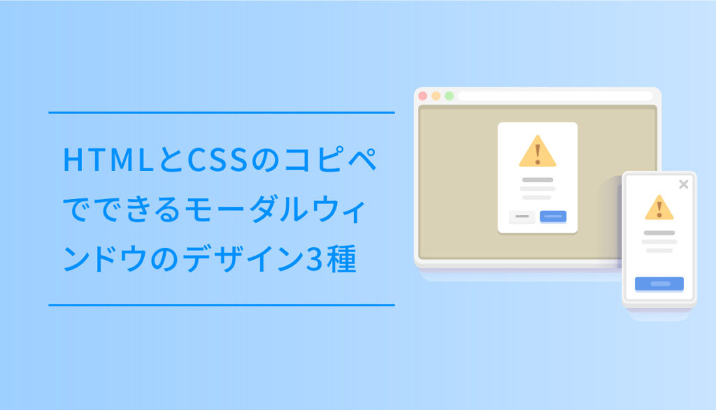
今回は、このHTMLとCSSのコピペでできるモーダルウィンドウのデザイン3種についてご紹介します。
標準的なモーダル
ボタンをプッシュするとモーダルが表示される標準的な仕様です
HTMLとCSSのみで作っています。
コードを表示する
HTML
<center>
<a href="#modal-01" class="modal-button">
モーダルを表示
</a>
</center>
<div class="modal-wrapper" id="modal-01">
  <a href="#!" class="modal-overlay"></a>
  <div class="modal-window">
    <div class="modal-content">
      <p class="modal_title">モーダルの中身</p>
      <p>
ああああああああああああああああああああああああああああああああああああああああああああああああああああああああああああああ
      </p>
      <p>
ああああああああああああああああああああああああああああああああああああああああああああああああああああああああああああああ
      </p>
    </div>
    <a href="#!" class="modal-close"><i class="far fa-times-circle"></i></a>
  </div>
</div>
CSS
.modal-wrapper {
  z-index: 999;
  position: fixed;
  top: 0;
  right: 0;
  bottom: 0;
  left: 0;
  padding: 40px 10px;
  text-align: center;
}

.modal-button {
    color: #4f96f6;
    background-color: #eeeeee;
    font-weight: bold;
    text-align: center;
    cursor :pointer;
    transition: all 0.3s;
    display: block;
    margin-top: 40px;
    margin-bottom: 1px;
    padding: 12px 2px;
    max-width:300px;
    text-decoration: none;
}

.modal-button:active {
  /*ボタンを押したとき*/
  -webkit-transform: translateY(2px);
  transform: translateY(2px);/*下に動く*/

}

/*アイコンを表示*/
.modal-button:after {
font-family: "Font Awesome 5 Free";
  content: "\f2d0";
    padding-left: 8px;
}

/*ラベルホバー時*/
.modal-button:hover {
  color: #FFFFFF;
  background-color: #4f96f6;
  transition: .6s;
}

.modal-wrapper:not(:target) {
  opacity: 0;
  visibility: hidden;
  transition: opacity .3s, visibility .3s;
}

.modal-wrapper:target {
  opacity: 1;
  visibility: visible;
  transition: opacity .4s, visibility .4s;
}

.modal-wrapper::after {
  display: inline-block;
  height: 100%;
  margin-left: -.05em;
  vertical-align: middle;
  content: ""
}

.modal-wrapper .modal-window {
  box-sizing: border-box;
  display: inline-block;
  z-index: 20;
  position: relative;
  width: 70%;
  max-width: 600px;
  padding: 10px 30px 25px;
  border-radius: 2px;
  background: #fff;
  box-shadow: 0 0 30px rgba(0, 0, 0, .6);
  vertical-align: middle
}

.modal-wrapper .modal-window .modal-content {
  max-height: 80vh;
  overflow-y: auto;
  text-align: left
}

.modal_title {
  font-size: 1.5em;
	position: relative;
	overflow: hidden;
  padding: 0;
}

.modal_title::before,
.modal_title::after{
	content: "";
	position: absolute;
	bottom: 0;
}

/* h2 プライマリカラー*/
.modal_title:before{
	border-bottom: 4px solid #6bb6ff;
	width: 100%;
}
/* h2 セカンダリカラー*/
.modal_title:after{
	border-bottom: 4px solid #c8e4ff;
	width: 100%;
}

.modal-content p {
  margin: 10px 0 0 0;
}

.modal-overlay {
  z-index: 10;
  position: absolute;
  top: 0;
  right: 0;
  bottom: 0;
  left: 0;
  background: rgba(0, 0, 0, .8)
}

.modal-wrapper .modal-close {
  z-index: 20;
  position: absolute;
  top: 5px;
  right: 5px;
  width: 35px;
  color: #95979c !important;
  font-size: 30px;
  font-weight: 700;
  line-height: 35px;
  text-align: center;
  text-decoration: none;
  text-indent: 0
}

.modal-wrapper .modal-close:hover {
  color: #2b2e38 !important
}
上から落ちてくるモーダル
ボタンをプッシュすると上からモーダルが落ちてくるように表示されるです。
モーダルウィンドウの表示位置はサイトによって指定してお使いください。
コードを表示する
HTML
<div class="modal_wrap">
<input id="trigger" type="checkbox">
    <div class="modal_overlay">
        <label for="trigger" class="modal_trigger"></label>
        <div class="modal_content">
            <label for="trigger" class="close_button">✖️</label>
            <p class="modal_title2">モーダル の中身を表示</p>
            <p>あああああああああああああああああああああああああああああああああああああああああああああああああああああああああああ</p>
        </div>
    </div>
</div>
<center>
<label for="trigger" class="open_button">モーダルを表示</label>
</center>
CSS
/*--------------------------------------
  モーダル表示上から_002
--------------------------------------*/
.modal_wrap input {
  display: none;
}

.modal_overlay {
  display: flex;
  justify-content: center;
  overflow: auto;
  position: fixed;
  top: 0;
  left: 0;
  z-index: 9999;
  width: 100%;
  height: 100%;
  background: rgba(0, 0, 0, 0.7);
  opacity: 0;
  transition: opacity 0.5s, transform 0s 0.5s;
  transform: scale(0);
}

.modal_trigger {
  position: absolute;
  width: 100%;
  height: 100%;
}

.modal_content {
    align-self: center;
    width: 60%;
    padding: 30px 30px 15px;
    box-sizing: border-box;
    background: #fff;
    line-height: 1.4em;
    transition: 0.5s;
}

.modal_content p {
  padding-top: 0;
}

.close_button {
  position: absolute;
  top: 14px;
  right: 16px;
  font-size: 24px;
  cursor: pointer;
}

.modal_wrap input:checked ~ .modal_overlay {
  opacity: 1;
  transform: scale(1);
  transition: opacity 0.5s;
}

.modal_wrap input:checked ~ .modal_overlay .modal_content {
  transform: translateY(20px);
}

.open_button {
   color: #4f96f6;
    background-color: #eeeeee;
    font-weight: bold;
    text-align: center;
    cursor :pointer;
    transition: all 0.3s;
    display: block;
    margin-top: 40px;
    margin-bottom: 1px;
    padding: 12px 2px;
    max-width:300px;
    text-decoration: none;
}

.open-button:active {
  /*ボタンを押したとき*/
  -webkit-transform: translateY(2px);
  transform: translateY(2px);/*下に動く*/

}

/*アイコンを表示*/
.open-button:after {
font-family: "Font Awesome 5 Free";
  content: "\f2d0";
    padding-left: 8px;
}

/*ラベルホバー時*/
.open-button:hover {
  color: #FFFFFF;
  background-color: #4f96f6;
  transition: .6s;
}

.modal_title2 {
  font-size: 1.5em;
	position: relative;
	overflow: hidden;
  padding-bottom: 10px;
  margin-top:0;
  margin-bottom: 0;
}

.modal_title2::before,
.modal_title2::after{
	content: "";
	position: absolute;
	bottom: 0;
}

/* h2 プライマリカラー*/
.modal_title2:before{
	border-bottom: 4px solid #6bb6ff;
	width: 100%;
}
/* h2 セカンダリカラー*/
.modal_title2:after{
	border-bottom: 4px solid #c8e4ff;
	width: 100%;
}
検索ウィジェットを表示するモーダル
ボタンをプッシュすると、検索窓がモーダルで開きます。
比較的PCより、スマホで使えるUIです。
コードを表示する
HTML
<!-- modal -->
<div class="header_searchicon"><label for="searchtrigger" class="open_button_search"><i class="fas fa-search"></i>サイト内検索</label></div>
<!-- modalinner -->
<div class="modal_wrap_search"> <input id="searchtrigger" type="checkbox">
  <div class="modal_overlaysearch"> <label for="searchtrigger" class="modal_searchtrigger"></label>
    <div class="modal_contentsearch"> <label for="searchtrigger" class="searchclose_button"><i class="fas fa-times"></i></label>
      <div class="search_midashi">
        <p>サイト内検索</p>
      </div>
      <!-- ここに検索のショートコード -->
    </div>
  </div>
</div>
<!-- modalinner -->
CSS
/* 検索のモーダル */
.header_searchicon {
    color: #4f96f6;
    background-color: #eeeeee;
    font-weight: bold;
    text-align: center;
    cursor: pointer;
    transition: all 0.3s;
    display: block;
    margin: 0 auto 1px;
    max-width: 300px;
    text-decoration: none;
}
.header_searchicon:hover {
    color: #FFFFFF;
    background-color: #4f96f6;
    transition: .6s;
    text-decoration: none;
}
.header_searchicon label {
    display: block;
    padding: 12px 8px;
   cursor:pointer;
}
.header_searchicon label i {
    padding-right: 5px;
}
.modal_wrap_search input {
  display: none;
}

.modal_overlaysearch {
  display: flex;
  justify-content: center;
  overflow: auto;
  position: fixed;
  top: 0;
  left: 0;
  z-index: 9999;
  width: 100%;
  height: 100%;
  background: rgba(0, 0, 0, 0.7);
  opacity: 0;
  transition: opacity 0.5s, transform 0s 0.5s;
  transform: scale(0);
}

.modal_searchtrigger {
  position: absolute;
  width: 100%;
  height: 100%;
}

.modal_contentsearch {
    align-self: center;
    width: 100vw;
    padding: 30px 30px 15px;
    box-sizing: border-box;
    background: transparent;
    line-height: 1.4em;
    top: 35%;
    transition: 0.5s;
    position: absolute;
}

.searchclose_button {
    position: absolute;
    bottom: -45px;
    right: 50%;
    transform: translateX(50%);
    cursor: pointer;
}

.modal_wrap_search input:checked ~ .modal_overlaysearch {
  opacity: 1;
  transform: scale(1);
  transition: opacity 0.5s;
}

.modal_wrap_search input:checked ~ .modal_overlaysearch .modal_contentsearch {
  transform: translateY(20px);
}

.open_button_search {
    transition: all 0.3s;
}

.open-button:active {
  /*ボタンを押したとき*/
  -webkit-transform: translateY(2px);
  transform: translateY(2px);/*下に動く*/

}

/*アイコンを表示*/
.open-button:after {
font-family: "Font Awesome 5 Free";
  content: "\f2d0";
    padding-left: 8px;
}

/*ラベルホバー時*/
.open-button:hover {
  color: #FFFFFF;
  background-color: #4f96f6;
  transition: .6s;
}

.search_midashi {
    display: block;
    text-align: center;
}
.search_midashi p {
    color: #FFF;
    margin-bottom: 15px;
    font-weight: 500;
    letter-spacing: 0.04rem;
    display: inline-block;
    position: relative;
}
.search_midashi p:before, .search_midashi p:after {
    display: inline-block;
    position: absolute;
    top: 50%;
    width: 20px;
    height: 3px;
    border-radius: 5px;
    background-color: #FFF;
    content: "";
}
.search_midashi p:before {
    left: -30px;
    -webkit-transform: rotate(
50deg );
    transform: rotate(
50deg );
}
.search_midashi p:after {
    right: -30px;
    -webkit-transform: rotate(
-50deg );
    transform: rotate(
-50deg );
}
.modal_contentsearch form#searchform input {
    display: block;
}
.modal_contentsearch label i {
    color: #707070;
    font-size: 1.6rem;
    background: #fff;
    padding: 8px 12px;
    border-radius: 50px;
    line-height: 1.6rem;
}
.searchform div {
    margin: 0 auto;
}
form#searchform div input {
    padding-left: 15px;
}