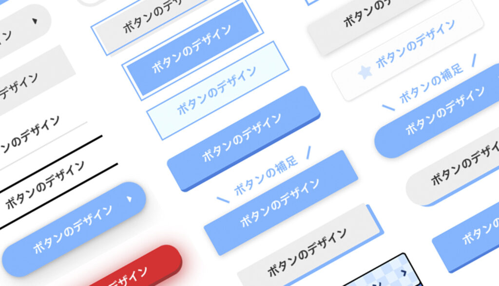
今はCSSのみで作られているボタンが主流で、かっこいいエフェクトやデザインがたくさんあります。その中でも「使えそうなもの」を想定しながら、この記事ではHTMLとCSSだけでボタンを作りました。
そんなボタンですが、サルワカさんのように100個作ろうと思って進めましたが、途中で見事に気持ちが折れ、この記事では50個の紹介です。
外部リンク CSSで作る!押したくなるボタンデザイン100(Web用)

100個は作れなかったす・・。
ボタンのデザインは、自分への備忘録的な部分が強いですが、ご覧頂き、その中でいいものがあればコピペして使ってくれると嬉しいです。
目次
- フラットなボタン
- 背景色と矢印付きのボタン
- hoverで矢印が少し右に動くボタン
- Font Awesomeアイコン付きのボタン
- 角丸の背景色と矢印付きのボタン
- 角丸背景とテキストの後ろにアイコン付きのボタン
- グラデーション背景色のボタン
- ちょっと飛び出た矢印のボタン
- 飛び出た矢印がhoverで引っ込むボタン
- 右側の線がhoverで矢印に変わるボタン
- hoverした時に左から右にカーテン
- hoverすると左から右にカーテン
- ちょっと斜めのボタン
- 斜めの状態でhoverすると四角に戻るボタン
- hoverすると左下から右上にカーテン
- 左にアイコンでhoverすると左から右にカーテン
- ずらした線と背景色がhoverで交差するボタン
- 斜めで右側に2本の線のボタン
- 斜めで右側に矢印のボタン
- ドッグイヤー風のボタン
- 左の矢印の丸がhoverでにゅいっと伸びるボタン
- 背景色がhoverで線に切り替わるボタン
- hoverでカーテンと右側に矢印が出るボタン
- 線のボタン
- 立体的なボタン
- 浮き上がるボタン
- 浮き上がるボタンに右に矢印を付けたボタン
- 角丸でアイコン付きの浮き上がるボタン
- 角丸で右に矢印を付けたボタン
- hoverすると右下に沈む角丸のボタン
- キラッとするボタン
- 下部に段差をつけたボタン
- ほんのり浮いたボタン
- 青から赤に変わるグロータイプのボタン
- マイクロコピー付きのボタン
- 角丸でマイクロコピー付きのボタン
- フラットだけど少し立体的に見えるボタン
- 右下の影がhoverで近付くボタン
- 右下の影にhoverで近付くボタン
- 角丸の影にhoverで近付くボタン
- 吹き出しでマイクロコピー付きのボタン
- イラストのようなボタン
- 背景チェッカーフラッグのイラストのようなボタン
- 反復してキラキラ光るボタン
- 反復してキラキラ光る角丸のボタン
- 左にアイコンのリボン付きのボタン
フラットなボタン
はじめに、フラットでシンプルなボタンです。
背景色と矢印付きのボタン
いたって普通のボタンです。hoverした時に背景色をつけることで、クリック要素であることをユーザーに伝えます。
コードを表示する
<div class="button001">
	<a href="#">ボタンのデザイン</a>
</div>/* 001 */
.button001 a {
background: #eee;
border-radius: 3px;
position: relative;
display: flex;
justify-content: space-around;
align-items: center;
margin: 0 auto;
max-width: 280px;
padding: 10px 25px;
color: #313131;
transition: 0.3s ease-in-out;
font-weight: 500;
}
.button001 a:hover {
background: #313131;
color: #FFF;
}
.button001 a:after {
content: '';
width: 5px;
height: 5px;
border-top: 3px solid #313131;
border-right: 3px solid #313131;
transform: rotate(45deg) translateY(-50%);
position: absolute;
top: 50%;
right: 20px;
border-radius: 1px;
transition: 0.3s ease-in-out;
}
.button001 a:hover:after {
border-color: #FFF;
}hoverで矢印が少し右に動くボタン
ボタンテキストの右側の矢印が、hoverすることで少し右に動くボタンです。滑らかなアニメーションは、transition のプロパティを使います。
コードを表示する
<div class="button019">
	<a href="#">ボタンのデザイン</a>
</div>/* 019 */
.button019 a {
background: #eee;
border-radius: 3px;
position: relative;
display: flex;
justify-content: space-around;
align-items: center;
margin: 0 auto;
max-width: 280px;
padding: 10px 25px;
color: #313131;
transition: 0.3s ease-in-out;
font-weight: 500;
}
.button019 a:after {
content: "";
position: absolute;
top: 50%;
bottom: 0;
right: 2rem;
font-size: 90%;
display: flex;
justify-content: center;
align-items: center;
transition: right 0.3s;
width: 6px;
height: 6px;
border-top: solid 2px currentColor;
border-right: solid 2px currentColor;
transform: translateY(-50%) rotate(45deg);
}
.button019 a:hover {
background: #6bb6ff;
color: #FFF;
}
.button019 a:hover:after {
right: 1.4rem;
}Font Awesomeアイコン付きのボタン
テキストの後に、Font Awesomeのアイコンを置いたボタンです。
コードを表示する
<div class="button002">
	<a href="#">ボタンのデザイン</a>
</div>/* 002 */
.button002 a {
background: #eee;
border-radius: 3px;
position: relative;
display: flex;
justify-content: center;
align-items: center;
margin: 0 auto;
max-width: 220px;
padding: 10px 25px;
color: #313131;
transition: 0.3s ease-in-out;
font-weight: 500;
}
.button002 a:before {
content: "\f201";
position: relative;
font-family: "Font Awesome 5 Free";
font-weight: 900;
margin-right: 8px;
color: #999;
}
.button002 a:hover {
background: #313131;
color: #FFF;
}角丸の背景色と矢印付きのボタン
CSSのborder-radiusで角丸にすると、柔らかいイメージのボタンになります。
コードを表示する
<div class="button003">
	<a href="#">ボタンのデザイン</a>
</div>/* 003 */
.button003 a {
background: #eee;
border-radius: 50px;
position: relative;
display: flex;
justify-content: space-around;
align-items: center;
margin: 0 auto;
max-width: 260px;
padding: 10px 25px;
color: #313131;
transition: 0.3s ease-in-out;
font-weight: 500;
}
.button003 a:hover {
background: #313131;
color: #FFF;
}
.button003 a:after {
content: '';
width: 5px;
height: 5px;
border-top: 3px solid #313131;
border-right: 3px solid #313131;
transform: rotate(45deg) translateY(-50%);
position: absolute;
top: 50%;
right: 20px;
border-radius: 1px;
transition: 0.3s ease-in-out;
}
.button003 a:hover:after {
border-color: #FFF;
}角丸背景とテキストの後ろにアイコン付きのボタン
テキストの後ろに、Font Awesomeのアイコンを置いたボタンです。
コードを表示する
<div class="button004">
	<a href="#">ボタンのデザイン</a>
</div>/* 004 */
.button004 a {
background: #eee;
border-radius: 50px;
position: relative;
display: flex;
justify-content: space-around;
align-items: center;
margin: 0 auto;
max-width: 260px;
padding: 10px 25px;
color: #313131;
transition: 0.3s ease-in-out;
font-weight: 500;
}
.button004 a:after {
position: absolute;
top: 50%;
right: 20px;
border-radius: 1px;
transition: 0.2s ease-in-out;
content: "\f0da";
font-family: "Font Awesome 5 Free";
font-weight: 900;
transform: translateY(-50%);
}
.button004 a:hover {
background: #313131;
color: #FFF;
}グラデーション背景色のボタン
背景色をグラデーションして、hoverすると色の比率がちょっと変わるボタンです。
コードを表示する
<div class="button005">
	<a href="#">ボタンのデザイン</a>
</div>/* 005 */
.button005 a {
border-radius: 3px;
position: relative;
display: flex;
justify-content: space-around;
align-items: center;
margin: 0 auto;
max-width: 220px;
padding: 10px 25px;
color: #FFF;
transition: 0.3s ease-in-out;
font-weight: 600;
background: rgb(149,202,252);
background: linear-gradient(270deg, rgba(149,202,252,1) 0%, rgba(107,182,255,1) 100%);
}
.button005 a:hover {
background: rgb(117,188,255);
background: linear-gradient(270deg, rgba(117,188,255,1) 0%, rgba(62,159,252,1) 100%);
}ちょっと飛び出た矢印のボタン
hoverすると、右側の矢印が右に水平移動します。
コードを表示する
<div class="button006">
	<a href="#">ボタンのデザイン</a>
</div>/* 006 */
.button006 a {
background: #eee;
position: relative;
display: flex;
justify-content: space-around;
align-items: center;
margin: 0 auto;
max-width: 240px;
padding: 10px 25px;
color: #313131;
transition: 0.3s ease-in-out;
font-weight: 500;
}
.button006 a:before {
content: '';
position: absolute;
top: calc(50% - 2px);
right: -2em;
transform: translateY(calc(-50% - 2px)) rotate(30deg);
width: 12px;
height: 2px;
background-color: #6bb6ff;
transition: 0.3s;
}
.button006 a:after {
content: '';
position: absolute;
top: 50%;
right: -2em;
transform: translateY(-50%);
width: 60px;
height: 2px;
background-color: #6bb6ff;
transition: 0.3s;
}
.button006 a:hover:before, .button006 a:hover:after {
right: -2.5em;
}
.button006 a:hover {
background: #edf6ff;
color: #6bb6ff;
}飛び出た矢印がhoverで引っ込むボタン
右側に飛び出ている矢印が、hoverすると引っ込むボタンです。その時は:hover:before 等、擬似要素をhoverで繋げます。
コードを表示する
<div class="button007">
	<a href="#">ボタンのデザイン</a>
</div>/* 007 */
.button007 a {
background: #eee;
position: relative;
display: flex;
justify-content: space-around;
align-items: center;
margin: 0 auto;
max-width: 240px;
padding: 10px 25px;
color: #313131;
transition: 0.3s ease-in-out;
font-weight: 500;
}
.button007 a:before {
content: '';
position: absolute;
top: calc(50% - 2px);
right: -1em;
transform: translateY(calc(-50% - 2px)) rotate(30deg);
width: 12px;
height: 2px;
background-color: #6bb6ff;
transition: 0.3s;
}
.button007 a:after {
content: '';
position: absolute;
top: 50%;
right: -1em;
transform: translateY(-50%);
width: 40px;
height: 2px;
background-color: #6bb6ff;
transition: 0.3s;
}
.button007 a:hover:before, .button007 a:hover:after {
right: -0.5em;
}
.button007 a:hover {
background: #edf6ff;
color: #6bb6ff;
}右側の線がhoverで矢印に変わるボタン
hoverすると、右側の線が矢印に変わります。
コードを表示する
<div class="button020">
	<a href="#">ボタンのデザイン</a>
</div>/* 020 */
.button020 a {
background: #eee;
position: relative;
display: flex;
justify-content: space-around;
align-items: center;
margin: 0 auto;
max-width: 240px;
padding: 10px 25px;
color: #313131;
transition: 0.3s ease-in-out;
font-weight: 500;
}
.button020 a:hover {
background: #edf6ff;
}
.button020 a:before, .button020 a:after {
content: "";
position: absolute;
display: block;
transition: all 0.3s;
right: 0.6rem;
top: 50%;
}
.button020 a:before {
width: 1.4rem;
height: 2px;
background: #614f38;
transform: translateY(-50%);
}
.button020 a:after {
opacity: 0;
width: 0;
height: 0;
border-top: solid 2px currentColor;
border-right: solid 2px currentColor;
transform: translateY(-50%) rotate(45deg);
}
.button020 a:hover:before {
width: 1.5rem;
}
.button020 a:hover:after {
opacity: 1;
width: 8px;
height: 8px;
}hoverした時に左から右にカーテン
before の擬似要素をwidth:0 にしておいて、hoverすると、擬似要素がwidth:100%で左から右に向かって表示されます。
コードを表示する
<div class="button008">
	<a href="#">ボタンのデザイン</a>
</div>/* 008 */
.button008 a {
background: #eee;
position: relative;
display: flex;
justify-content: space-around;
align-items: center;
margin: 0 auto;
max-width: 240px;
padding: 10px 25px;
color: #313131;
transition: 0.3s ease-in-out;
font-weight: 500;
z-index:0;
}
.button008 a:before {
content: "";
position: absolute;
top: 0;
bottom: 0;
width: 0;
display: block;
background: #6bb6ff;
transition: .3s;
left:0;
}
.button008 a:hover {
color: #FFF;
}
.button008 a:hover:before {
width: 100%;
z-index: -1;
}hoverすると左から右にカーテン
左にborderで色味を置いておき、hover した時のアニメーションに動きの関連性を持たせたボタンです。
コードを表示する
<div class="button013">
	<a href="#">ボタンのデザイン</a>
</div>/* 013 */
.button013 a {
background: #eee;
position: relative;
display: flex;
justify-content: space-around;
align-items: center;
margin: 0 auto;
max-width: 240px;
padding: 10px 25px;
color: #313131;
transition: 0.3s ease-in-out;
font-weight: 500;
z-index:0;
border-left: solid 5px #6bb6ff;
}
.button013 a:before {
content: "";
position: absolute;
top: 0;
bottom: 0;
width: 0;
display: block;
background: #6bb6ff;
transition: .3s;
left:0;
}
.button013 a:hover {
color: #FFF;
}
.button013 a:hover:before {
width: 100%;
z-index: -1;
}ちょっと斜めのボタン
CSSの clip-path を使ってクリッピング領域を作り、ちょっと斜めに傾けたボタンです。
コードを表示する
<div class="button009">
	<a href="#">ボタンのデザイン</a>
</div>/* 009 */
.button009 a {
background: #eee;
position: relative;
display: flex;
justify-content: space-around;
align-items: center;
margin: 0 auto;
max-width: 240px;
padding: 10px 25px;
color: #313131;
transition: 0.3s ease-in-out;
clip-path: polygon(5% 0%, 100% 0%, 95% 100%, 0% 100%);
}
.button009 a:hover {
background: #313131;
color: #FFF;
}斜めの状態でhoverすると四角に戻るボタン
CSSの transform: skew を使ったボタンです。
コードを表示する
<div class="button010">
	<a href="#">ボタンのデザイン</a>
</div>/* 010 */
.button010 a {
position: relative;
display: flex;
justify-content: space-around;
align-items: center;
margin: 0 auto;
max-width: 240px;
padding: 10px 25px;
color: #313131;
transition: 0.3s ease-in-out;
font-weight: 600;
transform: skew(-15deg);
color: #fff;
background-image: -webkit-gradient(linear, left top, right top, from(#2af598), to(#009efd));
background-image: -webkit-linear-gradient(left, #2af598 0%, #009efd 100%);
background-image: linear-gradient(90deg, #2af598 0%, #009efd 100%);
-webkit-box-shadow: 0 5px 10px rgba(0, 0, 0, .1);
box-shadow: 0 5px 10px rgba(0, 0, 0, .1);
}
.button010 a:hover {
-webkit-transform: skew(0);
transform: skew(0);
color: #fff;
-webkit-box-shadow: 0 2px 3px rgba(0, 0, 0, .1);
box-shadow: 0 2px 3px rgba(0, 0, 0, .1);
}hoverすると左下から右上にカーテン
hoverすると、beforeの擬似要素が右上に向かって要素を覆い尽くします。
コードを表示する
<div class="button011">
	<a href="#">ボタンのデザイン</a>
</div>/* 011 */
.button011 a {
position: relative;
display: flex;
justify-content: space-around;
align-items: center;
margin: 0 auto;
max-width: 240px;
padding: 10px 25px;
color: #313131;
transition: 0.3s ease-in-out;
font-weight: 600;
background: #eee;
overflow:hidden;
}
.button011 a:before {
position: absolute;
top: 0;
left: 0;
width: 150%;
height: 500%;
content: "";
-webkit-transition: all 0.5s ease-in-out;
transition: all 0.5s ease-in-out;
-webkit-transform: translateX(-98%) translateY(-25%) rotate(45deg);
transform: translateX(-98%) translateY(-25%) rotate(45deg);
background: #6bb6ff;
opacity: 0.2;
}
.button011 a:hover:before {
-webkit-transform: translateX(-9%) translateY(-25%) rotate(45deg);
transform: translateX(-9%) translateY(-25%) rotate(45deg);
}左にアイコンでhoverすると左から右にカーテン
左にFont Awesomeのアイコンを置き、hoverすると色味が変わるボタンです。
コードを表示する
<div class="button012">
	<a href="#">ボタンのデザイン</a>
</div>/* 012 */
.button012 a {
position: relative;
display: flex;
justify-content: center;
align-items: center;
margin: 0 auto;
max-width: 240px;
padding: 10px 25px 10px 50px;
color: #313131;
transition: 0.3s ease-in-out;
font-weight: 600;
background: #eee;
border-radius: 50px;
z-index:0;
overflow: hidden;
}
.button012 a:before {
font-family: "Font Awesome 5 Free";
content: "\f005";
line-height: 1;
position: absolute;
left: 5px;
background: #FFF;
padding: 12px 11px;
border-radius: 60px;
z-index: 2;
}
.button012 a:after {
content: "";
position: absolute;
top: 0;
bottom: 0;
width: 0;
display: block;
background: #ccc;
transition: .3s;
left:0;
}
.button012 a:hover:after {
width: 100%;
z-index: -1;
}ずらした線と背景色がhoverで交差するボタン
要素の左上の枠線が、hoverすると要素と同じ位置に移動して色味が変わるボタンです。
コードを表示する
<div class="button014">
	<a href="#">ボタンのデザイン</a>
</div>/* 014 */
.button014 a {
background: #eee;
position: relative;
display: flex;
justify-content: space-around;
align-items: center;
margin: 0 auto;
max-width: 240px;
padding: 10px 25px;
color: #313131;
transition: 0.3s ease-in-out;
font-weight: 500;
}
.button014 a::before {
content: '';
position: absolute;
top: -5px;
left: -5px;
width: calc(100% - 4px);
height: calc(100% - 4px);
border: 2px solid #6bb6ff;
transition: 0.2s;
}
.button014 a::after {
content: '';
width: 5px;
height: 5px;
border-top: 3px solid #333333;
border-right: 3px solid #333333;
transform: rotate(45deg);
}
.button014 a:hover::before {
top: 0;
left: 0;
}
.button014 a:hover {
text-decoration: none;
background-color: #b3d9ff;
}斜めで右側に2本の線のボタン
transform: skewX で傾けて、右側に2本の線を置いたボタンです。線によって、躍動感が出ます。
コードを表示する
<div class="button015">
  <a href="#"><span>ボタンのデザイン</span></a>
</div>/* 015 */
.button015 a {
background: #eee;
position: relative;
display: flex;
justify-content: space-around;
align-items: center;
margin: 0 auto;
max-width: 220px;
padding: 10px 25px;
color: #313131;
transition: 0.3s ease-in-out;
font-weight: 500;
transform: skew(-10deg, 0deg);
}
.button015 a span {
transform: skewX(10deg);
}
.button015 a:before {
content: "";
width: 35px;
height: 2px;
position: absolute;
right: -20px;
background: #313131;
top: 35%;
transition: 0.3s ease-in-out;
}
.button015 a:after {
content: "";
width: 20px;
height: 2px;
position: absolute;
right: -5px;
background: #313131;
top: 55%;
transition: 0.3s ease-in-out;
}
.button015 a:hover:before, .button015 a:hover:after {
transform: translateX(5px);
}斜めで右側に矢印のボタン
これもCSSのtransform: skewX で傾けて、右側に矢印を置いたボタンです。単に四角よりは、傾けることで動きが出ます。
コードを表示する
<div class="button016">
  <a href="#"><span>ボタンのデザイン</span></a>
</div>/* 016 */
.button016 a {
background: #eee;
position: relative;
display: flex;
justify-content: space-around;
align-items: center;
margin: 0 auto;
max-width: 220px;
padding: 10px 25px;
color: #313131;
transition: 0.3s ease-in-out;
font-weight: 500;
transform: skew(-10deg, 0deg);
}
.button016 a span {
transform: skewX(10deg);
}
.button016 a:before {
content: '';
position: absolute;
top: calc(50% - 2px);
right: -1em;
transform: translateY(calc(-50% - 2px)) rotate(30deg);
width: 12px;
height: 2px;
background-color: #6bb6ff;
transition: 0.3s;
}
.button016 a:after {
content: '';
position: absolute;
top: 50%;
right: -1em;
transform: translateY(-50%);
width: 40px;
height: 2px;
background-color: #6bb6ff;
transition: 0.3s;
}
.button016 a:hover:before, .button016 a:hover:after {
right: -1.2em;
}
.button016 a:hover {
background: #edf6ff;
color: #6bb6ff;
}ドッグイヤー風のボタン
読みかけのページを折るようなドッグイヤー風のボタンです。
コードを表示する
<div class="button017">
	<a href="#">ボタンのデザイン</a>
</div>/* 017 */
.button017 a {
background: #eee;
position: relative;
display: flex;
justify-content: space-around;
align-items: center;
margin: 0 auto;
max-width: 220px;
padding: 10px 25px;
color: #313131;
transition: 0.3s ease-in-out;
font-weight: 500;
}
.button017 a:before {
position: absolute;
top: 0;
right: 0;
content: '';
width: 0;
border-width: 0 16px 16px 0;
border-style: solid;
border-color: #fafcfc #fafcfc #c7c7c7 #cbcbcb;
box-shadow: -1px 1px 2px rgb(0 0 0 / 10%);
}左の矢印の丸がhoverでにゅいっと伸びるボタン
コードを表示する
<div class="button018">
  <a href="#"><span>ボタンのデザイン</span></a>
</div>/* 018 */
.button018 a {
position: relative;
display: flex;
justify-content: space-around;
align-items: center;
margin: 0 auto;
max-width: 225px;
padding: 10px 0px 10px 25px;
color: #313131;
transition: 0.3s ease-in-out;
font-weight: 500;
}
.button018 a:before, .button018 a:after {
content: "";
position: absolute;
display: block;
top: 50%;
}
.button018 a:before {
width: 0.5rem;
height: 0.5rem;
left: 1.1rem;
border-top: solid 2px #fff;
border-right: solid 2px #fff;
z-index: 2;
transform: translateY(-50%) rotate(45deg);
transition: all 0.3s;
}
.button018 a:after {
left: 0;
background: #6bb6ff;
z-index: 1;
width: 3rem;
height: 3rem;
border-radius: 4rem;
transform: translateY(-50%);
transition: all 0.5s;
}
.button018 a span {
position: relative;
transition: all 0.3s;
z-index: 3;
}
.button018 a:hover span {
color: #fff;
}
.button018 a:hover:before {
left: 2rem;
}
.button018 a:hover:after {
right: 0;
width: 100%;
}背景色がhoverで線に切り替わるボタン
背景色のフラットなボタンをhoverすると、背景色が小さくなりながら線に変わります。
コードを表示する
<div class="button021">
	<a href="#">ボタンのデザイン</a>
</div>/* 021 */
.button021 a {
position: relative;
display: flex;
justify-content: space-around;
align-items: center;
margin: 0 auto;
max-width: 240px;
padding: 10px 25px;
color: #313131;
transition: 0.3s ease-in-out;
font-weight: 500;
}
.button021 a::before {
content: "";
position: absolute;
top: 0;
left: 0;
width: 100%;
height: 100%;
z-index: 1;
background-color: rgba(107,182,255, 0.2);
transition: all 0.3s;
}
.button021 a:hover::before {
opacity: 0;
transform: scale(0.4, 0.4);
}
.button021 a::after {
content: "";
position: absolute;
top: 0;
left: 0;
width: 100%;
height: 100%;
z-index: 1;
opacity: 0;
transition: all 0.3s;
border: 2px solid rgb(107,182,255, .4);
transform: scale(1.2, 1.2);
}
.button021 a:hover::after {
opacity: 1;
transform: scale(1, 1);
}hoverでカーテンと右側に矢印が出るボタン
hoverすると、ボタンの右側に矢印が出て、右下からカーテン状に色が付きます。
コードを表示する
<div class="button022">
	<a href="#">ボタンのデザイン</a>
</div>/* 022 */
.button022 a {
position: relative;
display: flex;
justify-content: space-around;
align-items: center;
margin: 0 auto;
max-width: 240px;
padding: 10px 25px;
color: #313131;
transition: 0.3s ease-in-out;
font-weight: 600;
background: #eee;
z-index: 0;
}
.button022 a:before, .button022 a:after {
content: "";
position: absolute;
display: block;
transition: all 0.3s;
}
.button022 a:before {
opacity: 0;
width: 7px;
height: 7px;
top: 50%;
right: 1.4rem;
border-top: solid 2px #FFF;
border-right: solid 2px #FFF;
transform: translateY(-50%) rotate(45deg);
}
.button022 a:after {
opacity: 0;
right: -2px;
bottom: -2px;
background: #6bb6ff;
z-index: -1;
width: 0;
height: 0;
}
.button022 a:hover {
padding: 10px 25px 10px 10px;
color: #FFF;
}
.button022 a:hover:before {
opacity: 1;
border-color: #FFF;
}
.button022 a:hover:after {
opacity: 1;
width: calc(100% + 2px);
height: calc(100% + 2px);
}線のボタン
シンプルなデザインに合わせやすい線のボタンです。
下線が伸びるボタン
薄グレーの線の上を、hoverすると実線が左から右になぞるように伸びるボタンです。
コードを表示する
<div class="button_line001">
  <a href="#">ボタンのデザイン</a>
</div>/* LINE001 */
.button_line001 a {
position: relative;
display: flex;
justify-content: space-around;
align-items: center;
margin: 0 auto;
max-width: 200px;
padding: 10px 25px;
color: #313131;
transition: 0.3s ease-in-out;
font-weight: 600;
}
.button_line001 a:before {
position: absolute;
bottom: 0px;
left: 50%;
content: '';
width: 100%;
height: 2px;
background: rgba(0,0,0,.1);
transform: translateX(-50%);
}
.button_line001 a:after {
position: absolute;
bottom: 0px;
left: 0;
content: '';
width: 100%;
height: 2px;
background: #000;
transform: scale(0, 1);
transform-origin: left top;
transition: transform .3s;
}
.button_line001 a:hover {
opacity: 0.7;
}
.button_line001 a:hover:after {
transform: scale(1, 1);
}hoverで浮き上がる下線のボタン
線だけだと、リンク要素と分かりづらいので、hoverすると線が少し移動します。
コードを表示する
<div class="button_line002">
  <a href="#">ボタンのデザイン</a>
</div>/* LINE002 */
.button_line002 a {
position: relative;
display: flex;
justify-content: space-around;
align-items: center;
margin: 0 auto;
max-width: 200px;
padding: 10px 25px;
color: #313131;
transition: 0.3s ease-in-out;
font-weight: 600;
}
.button_line002 a:before {
position: absolute;
content: '';
width: 100%;
height: 3px;
top: 100%;
left: 0;
border-radius: 3px;
background: #67c5ff;
transition: .2s;
}
.button_line002 a:hover:before {
top: calc(100% - 2px);
}グラデーションの下線
hoverすると、グラデーションの下線が中央から外側に向け表示されるボタンです。
コードを表示する
<div class="button_line003">
  <a href="#">ボタンのデザイン</a>
</div>/* LINE003 */
.button_line003 a {
position: relative;
display: flex;
justify-content: space-around;
align-items: center;
margin: 0 auto;
max-width: 200px;
padding: 10px 25px;
color: #313131;
transition: 0.3s ease-in-out;
font-weight: 600;
z-index: 1;
}
.button_line003 a:after {
background: linear-gradient(to right, #e55d87, #5fc3e4);
width: 0px;
height: 23px;
position: absolute;
content: "";
display: block;
transition: all 200ms ease-in-out;
bottom: 0px;
z-index: -1;
}
.button_line003 a:hover:after {
width: 100%;
}枠線を表示するボタン
hoverすると、囲みの線が表示され、リンク要素の背景色も変わるボタンです。見た目はシンプルですが、コード量は多めです。
コードを表示する
<div class="button_line004">
  <a href="#">ボタンのデザイン</a>
</div>/* LINE004 */
.button_line004 a {
position: relative;
display: flex;
justify-content: space-around;
align-items: center;
margin: 0 auto;
max-width: 200px;
padding: 10px 25px;
color: #313131;
transition: 0.3s ease-in-out;
font-weight: 600;
}
.button_line004 a:before,
.button_line004 a:after {
content: '';
width: 18px;
height: 18px;
border-color: #6bb6ff;
box-sizing: border-box;
border-style :solid;
display: block;
position: absolute;
transition: all 0.3s ease-in-out;
}
.button_line004 a:before {
top: -6px;
left: -6px;
border-width: 2px 0 0 2px;
z-index: 5;
}
.button_line004 a:after {
bottom: -6px;
right: -6px;
border-width: 0 2px 2px 0;
}
.button_line004 a:hover:before,
.button_line004 a:hover:after {
width: calc(100% + 12px);
height: calc(100% + 12px);
border-color: #6bb6ff;
}
.button_line004 a:hover {
color: #fff;
background-color: #6bb6ff;
border-color: #6bb6ff;
}左下の囲み線のボタン
左下に要素を囲む線があるボタンです。hoverすると、テキストが右方向に少し移動します。
コードを表示する
<div class="button_line005">
  <a href="#">ボタンのデザイン</a>
</div>/* LINE005 */
.button_line005 a {
position: relative;
display: flex;
justify-content: center;
align-items: center;
margin: 0 auto;
max-width: 200px;
padding: 10px 5px;
color: #6bb6ff;
transition: 0.3s ease-in-out;
font-weight: 600;
border-bottom: solid 3px #6bb6ff;
border-left: solid 3px #6bb6ff;
}
.button_line005 a:before {
font-family: "Font Awesome 5 Free";
content: "\f0da";
padding-right: 8px;
position: relative;
}
.button_line005 a:hover {
padding-left: 0.7em;
padding-right: 0.3em;
}上下に線のボタン
テキストの上下に線があるボタンで、hoverすると線が消えます。
コードを表示する
<div class="button_line006">
  <a href="#">ボタンのデザイン</a>
</div>/* LINE006 */
.button_line006 a {
position: relative;
display: flex;
justify-content: space-around;
align-items: center;
margin: 0 auto;
max-width: 220px;
padding: 10px 25px;
color: #313131;
transition: 0.3s ease-in-out;
font-weight: 600;
}
.button_line006 a:before,
.button_line006 a:after {
position: absolute;
width: 100%;
height: 3px;
content: '';
-webkit-transition: all .3s;
transition: all .3s;
background: #000;
}
.button_line006 a:before {
top: 0;
left: 0;
}
.button_line006 a:after {
right: 0;
bottom: 0;
}
.button_line006 a:hover:before,
.button_line006 a:hover:after {
width: 0;
}囲みの線がhoverでぐるっと色が変わるボタン
hoverすると、囲みの線が表示されぐるっと覆います。
hoverした時に、transitionを使えば、このようにちょっとしたアニメーションさせることができます。
コードを表示する
<div class="button_line007">
  <a href="#">ボタンのデザイン</a>
</div>/* LINE007 */
.button_line007 a {
position: relative;
display: flex;
justify-content: space-around;
align-items: center;
margin: 0 auto;
max-width: 220px;
padding: 10px 25px;
color: #313131;
transition: 0.3s ease-in-out;
font-weight: 600;
background: #eee;
}
.button_line007 a:hover {
background: #ebfcfe;
color: #6bb6ff;
}
.button_line007 a:before, .button_line007 a:after {
box-sizing: inherit;
content: "";
position: absolute;
border: 2px solid transparent;
width: 0;
height: 0;
}
.button_line007 a:before {
top: 0;
left: 0;
}
.button_line007 a:after {
bottom: 0;
right: 0;
}
.button_line007 a:hover:before, .button_line007 a:hover:after {
width: 100%;
height: 100%;
}
.button_line007 a:hover:before {
border-top-color: #6bb6ff;
border-right-color: #6bb6ff;
transition: width 0.15s ease-out, height 0.15s ease-out 0.15s;
}
.button_line007 a:hover:after {
border-bottom-color: #6bb6ff;
border-left-color: #6bb6ff;
transition: border-color 0s ease-out 0.2s, width 0.15s ease-out 0.2s, height 0.15s ease-out 0.3s;
}立体的なボタン
直感的に操作が分かりやすい立体的なボタンです。
浮き上がるボタン
シャドウをつけ、奥行きを感じるボタンです。hoverすると、浮き上がります。
コードを表示する
<div class="button_solid001">
  <a href="#">ボタンのデザイン</a>
</div>/* solid001 */
.button_solid001 a {
position: relative;
display: flex;
justify-content: space-around;
align-items: center;
margin: 0 auto;
max-width: 240px;
padding: 10px 25px;
color: #313131;
transition: 0.3s ease-in-out;
font-weight: 600;
background: #eee;
filter: drop-shadow(0px 2px 4px #ccc);
border-radius: 3px;
}
.button_solid001 a:hover {
transform: translateY(-2px);
box-shadow: 0 15px 30px -5px rgb(0 0 0 / 15%), 0 0 5px rgb(0 0 0 / 10%);
}浮き上がるボタンに右に矢印を付けたボタン
シャドウをつけ、奥行きを感じるボタンです。hoverすると、浮き上がります。
コードを表示する
<div class="button_solid018">
  <a href="#">ボタンのデザイン</a>
</div>/* solid018 */
.button_solid018 a {
position: relative;
display: flex;
justify-content: space-around;
align-items: center;
margin: 0 auto;
max-width: 240px;
padding: 10px 25px;
color: #313131;
transition: 0.3s ease-in-out;
font-weight: 600;
background: #eee;
filter: drop-shadow(0px 2px 4px #ccc);
border-radius: 3px;
}
.button_solid018 a:hover {
transform: translateY(-2px);
box-shadow: 0 15px 30px -5px rgb(0 0 0 / 15%), 0 0 5px rgb(0 0 0 / 10%);
}
.button_solid018 a:after {
content: '';
width: 5px;
height: 5px;
border-top: 3px solid #313131;
border-right: 3px solid #313131;
transform: rotate(45deg) translateY(-48%);
position: absolute;
top: 48%;
right: 20px;
border-radius: 1px;
transition: 0.3s ease-in-out;
}角丸でアイコン付きの浮き上がるボタン
角丸のボタンで、右側にFont Awesomeのアイコンが付きます。浮き上がる感じは、transform: translateY(-2px); とbox-shadow で表現します。
コードを表示する
<div class="button_solid002">
  <a href="#">ボタンのデザイン</a>
</div>/* solid002 */
.button_solid002 a {
position: relative;
display: flex;
justify-content: space-around;
align-items: center;
margin: 0 auto;
max-width: 240px;
padding: 10px 25px;
color: #FFF;
transition: 0.3s ease-in-out;
font-weight: 600;
background: #6bb6ff;
filter: drop-shadow(0px 2px 4px #ccc);
border-radius: 3px;
border-radius: 50px;
}
.button_solid002 a:after {
position: absolute;
top: 50%;
right: 20px;
transition: 0.2s ease-in-out;
content: "\f0da";
font-family: "Font Awesome 5 Free";
font-weight: 900;
transform: translateY(-50%);
}
.button_solid002 a:hover {
transform: translateY(-2px);
box-shadow: 0 15px 30px -5px rgb(0 0 0 / 15%), 0 0 5px rgb(0 0 0 / 10%);
}角丸で右に矢印を付けたボタン
角丸のボタンに、擬似要素after で矢印をつけたボタンです。Font Awesomeを使わないので、汎用性が高いです。
コードを表示する
<div class="button_solid019">
  <a href="#">ボタンのデザイン</a>
</div>/* solid019 */
.button_solid019 a {
position: relative;
display: flex;
justify-content: space-around;
align-items: center;
margin: 0 auto;
max-width: 240px;
padding: 10px 25px;
color: #FFF;
transition: 0.3s ease-in-out;
font-weight: 600;
background: #6bb6ff;
filter: drop-shadow(0px 2px 4px #ccc);
border-radius: 3px;
border-radius: 50px;
}
.button_solid019 a:after {
content: '';
width: 5px;
height: 5px;
border-top: 3px solid #FFF;
border-right: 3px solid #FFF;
transform: rotate(45deg) translateY(-50%);
position: absolute;
top: 46%;
right: 20px;
border-radius: 1px;
transition: 0.3s ease-in-out;
}
.button_solid019 a:hover {
transform: translateY(-2px);
box-shadow: 0 15px 30px -5px rgb(0 0 0 / 15%), 0 0 5px rgb(0 0 0 / 10%);
}hoverすると右下に沈む角丸のボタン
よく見かける反復してキラキラ光るボタンです。keyframes でアニメーションの動きを指定して、キラキラ光るエフェクトがかかります。
コードを表示する
<div class="button_solid017">
  <a href="#">ボタンのデザイン</a>
</div>/* solid017 */
.button_solid017 a {
position: relative;
display: flex;
justify-content: space-around;
align-items: center;
margin: 0 auto;
max-width: 240px;
padding: 10px 25px;
color: #543618;
transition: 0.3s ease-in-out;
font-weight: 600;
background: #eeee;
border-radius: 50px;
border: 0.2rem solid #543618;
box-shadow: 0.2rem 0.2rem 0px 0.1rem #cccccc;
}
.button_solid017 a:hover {
transform: translate3d(0.2rem, 0.2rem, 0);
box-shadow: none;
opacity: 1;
transition: all 0.2s;
}
.button_solid017 a:after {
content: '';
width: 5px;
height: 5px;
border-top: 3px solid #543618;
border-right: 3px solid #543618;
transform: rotate(45deg) translateY(-50%);
position: absolute;
top: 50%;
right: 20px;
border-radius: 1px;
transition: 0.3s ease-in-out;
}キラッとするボタン
コードを表示する
<div class="button_solid003">
  <a href="#">ボタンのデザイン</a>
</div>/* solid003 */
.button_solid003 a {
position: relative;
display: flex;
justify-content: space-around;
align-items: center;
margin: 0 auto;
max-width: 240px;
padding: 10px 25px;
color: #FFF;
transition: 0.3s ease-in-out;
font-weight: 600;
background: #6bb6ff;
filter: drop-shadow(0px 2px 4px #ccc);
border-radius: 3px;
border-radius: 50px;
overflow: hidden;
}
.button_solid003 a:before{
content: '';
display: block;
position: absolute;
width: 100%;
height: 100%;
top: 0;
left: -100%;
background-image: linear-gradient(
130deg, rgba(255, 255, 255, 0) 25%, rgba(255, 255, 255, 0.3) 50%, rgba(255, 255, 255, 0) 55%);
-webkit-transition: 0.5s;
transition: 0.6s;
}
.button_solid003 a:hover:before {
left: 100%;
}
.button_solid003 a:after {
position: absolute;
top: 50%;
right: 20px;
transition: 0.2s ease-in-out;
content: "\f0da";
font-family: "Font Awesome 5 Free";
font-weight: 900;
transform: translateY(-50%);
}下部に段差をつけたボタン
コードを表示する
<div class="button_solid004">
  <a href="#">ボタンのデザイン</a>
</div>/* solid004 */
.button_solid004 a {
position: relative;
display: flex;
justify-content: space-around;
align-items: center;
margin: 0 auto;
max-width: 240px;
padding: 10px 25px;
color: #FFF;
transition: 0.3s ease-in-out;
font-weight: 600;
background: #6bb6ff;
border-radius: 8px;
border-bottom: solid 5px #1d7fde;
}
.button_solid004 a:hover {
border-bottom: solid 2px #1d7fde;
transform: translateY(3px);
}ほんのり浮いたボタン
立体的ですが、影の付け方を緩めにするだけで柔らかしい印象になります。その場合、border-color: rgb(80,80,80,0.1); で、かなり薄めのグレーで境界線をつけて境界線を作るとベターです。
コードを表示する
<div class="button_solid005">
  <a href="#">ボタンのデザイン</a>
</div>/* 005 */
.button_solid005 a {
position: relative;
display: flex;
justify-content: center;
align-items: center;
margin: 0 auto;
max-width: 240px;
padding: 6px 25px;
color: #6bb6ff;
transition: 0.3s ease-in-out;
font-weight: 600;
background: #fcfcfc;
border: 1px solid transparent;
box-shadow: 0 2px 4px -2px rgb(33 37 56 / 25%);
border-radius: 0.45rem;
border-color: rgb(80,80,80,0.1);
}
.button_solid005 a:hover {
opacity: 0.8;
}
.button_solid005 a:before {
content: "\f005";
position: relative;
font-family: "Font Awesome 5 Free";
font-weight: 900;
margin-right: 8px;
color: #6bb6ff;
opacity: 0.3;
font-size: 1.3rem;
transform: translateY(-1px);
}青から赤に変わるグロータイプのボタン
光が放射状に出ているイメージのボタンです。比較的汎用性も高く、これ以外にもスニペットがあるので、興味のある方は以下関連記事をご覧ください。
関連記事 HTMLとCSSのコピペでできるグローデザインのボタン10個
コードを表示する
<div class="button_solid006">
  <a href="#">ボタンのデザイン</a>
</div>/* 006 */
.button_solid006 a {
position: relative;
display: flex;
justify-content: center;
align-items: center;
margin: 0 auto;
max-width: 240px;
padding: 6px 25px;
background: #6bb6ff;
color: #FFF;
transition: 0.3s ease-in-out;
font-weight: 600;
border-radius: 100px;
box-shadow: 0 5px 0px #4f96f6, 0 10px 100px #4f96f6;
}
.button_solid006 a:hover{
background:#FF2F2F;
box-shadow: 0 5px 0px #B73434,0 7px 30px #FF2F2F;
}
.button_solid006 a:active{
background:#FF8282;
box-shadow: 0 0px 10px #FF8282;
box-shadow: 0 5px 0px #CC6262,0 4px 10px #FF8282;
}マイクロコピー付きのボタン
コードを表示する
<div class="button_solid007">
  <p>ボタンの補足</p>
  <a href="#">ボタンのデザイン</a>
</div>/* solid007 */
.button_solid007 {
text-align: center;
}
.button_solid007 p {
margin-bottom: 5px;
font-weight: 600;
color: #6bb6ff;
letter-spacing: 0.04rem;
display: inline-block;
position: relative;
}
.button_solid007 p:before, .button_solid007 p:after {
display: inline-block;
position: absolute;
top: 45%;
width: 20px;
height: 3px;
border-radius: 5px;
background-color: #6bb6ff;
content: "";
}
.button_solid007 p:before {
left: -30px;
-webkit-transform: rotate( 50deg );
transform: rotate( 50deg );
}
.button_solid007 p:after {
right: -30px;
-webkit-transform: rotate( -50deg );
transform: rotate( -50deg );
}
.button_solid007 a {
position: relative;
display: flex;
justify-content: space-around;
align-items: center;
margin: 0 auto;
max-width: 240px;
padding: 10px 25px;
color: #FFF;
transition: 0.3s ease-in-out;
font-weight: 600;
background: #6bb6ff;
filter: drop-shadow(0px 2px 4px #ccc);
border-radius: 3px;
}
.button_solid007 a:hover {
transform: translateY(-2px);
box-shadow: 0 15px 30px -5px rgb(0 0 0 / 15%), 0 0 5px rgb(0 0 0 / 10%);
}角丸でマイクロコピー付きのボタン
コードを表示する
<div class="button_solid015">
  <p>ボタンの補足</p>
  <a href="#">ボタンのデザイン</a>
</div>/* solid015 */
.button_solid015 {
text-align: center;
}
.button_solid015 p {
margin-bottom: 5px;
font-weight: 600;
color: #6bb6ff;
letter-spacing: 0.04rem;
display: inline-block;
position: relative;
}
.button_solid015 p:before, .button_solid015 p:after {
display: inline-block;
position: absolute;
top: 45%;
width: 20px;
height: 3px;
border-radius: 5px;
background-color: #6bb6ff;
content: "";
}
.button_solid015 p:before {
left: -30px;
-webkit-transform: rotate( 50deg );
transform: rotate( 50deg );
}
.button_solid015 p:after {
right: -30px;
-webkit-transform: rotate( -50deg );
transform: rotate( -50deg );
}
.button_solid015 a {
position: relative;
display: flex;
justify-content: space-around;
align-items: center;
margin: 0 auto;
max-width: 240px;
padding: 10px 25px;
color: #FFF;
transition: 0.3s ease-in-out;
font-weight: 600;
background: #6bb6ff;
filter: drop-shadow(0px 2px 4px #ccc);
border-radius: 50px;
}
.button_solid015 a:hover {
transform: translateY(-2px);
box-shadow: 0 15px 30px -5px rgb(0 0 0 / 15%), 0 0 5px rgb(0 0 0 / 10%);
}
.button_solid015 a:after {
position: absolute;
top: 50%;
right: 20px;
transition: 0.2s ease-in-out;
content: "\f0da";
font-family: "Font Awesome 5 Free";
font-weight: 900;
transform: translateY(-54%);
}フラットだけど少し立体的に見えるボタン
コードを表示する
<div class="button_solid008">
  <a href="#">ボタンのデザイン</a>
</div>/* solid008 */
.button_solid008 a{
background: #eee;
border-radius: 3px;
position: relative;
display: flex;
justify-content: center;
align-items: center;
margin: 0 auto;
max-width: 220px;
padding: 10px 25px;
color: #313131;
transition: 0.3s ease-in-out;
font-weight: 500;
}
.button_solid008 a::before {
content: '';
position: absolute;
bottom: -7px;
right: -7px;
width: 100%;
height: 2px;
background-color: #bbbbbb;
transition: 0.2s ease 0s;
}
.button_solid008 a::after {
content: '';
position: absolute;
top: 7px;
right: -7px;
width: 2px;
height: 100%;
background-color: #bbbbbb;
transition: 0.2s ease 0.2s;
}
.button_solid008 a:hover::before {
width: 0%;
}
.button_solid008 a:hover::after {
height: 0%;
}
.button_solid008 a:hover {
text-decoration: none;
background-color: #ccc;
}右下の影がhoverで近付くボタン
コードを表示する
<div class="button_solid009">
  <a href="#">ボタンのデザイン</a>
</div>/* solid009 */
.button_solid009 a{
background: #eee;
border-radius: 3px;
position: relative;
display: flex;
justify-content: center;
align-items: center;
margin: 0 auto;
max-width: 220px;
padding: 10px 25px;
color: #313131;
transition: 0.3s ease-in-out;
font-weight: 600;
box-shadow: 5px 5px 0 #6bb6ff;
}
.button_solid009 a:hover {
background-color: #b3d9ff;
box-shadow: 0 0 0;
}右下の影にhoverで近付くボタン
コードを表示する
<div class="button_solid010">
  <a href="#">ボタンのデザイン</a>
</div>/* solid010 */
.button_solid010 a{
background: #eee;
border-radius: 3px;
position: relative;
display: flex;
justify-content: center;
align-items: center;
margin: 0 auto;
max-width: 220px;
padding: 10px 25px;
color: #313131;
transition: 0.3s ease-in-out;
font-weight: 600;
box-shadow: 5px 5px 0 #6bb6ff;
}
.button_solid010 a:hover {
background-color: #b3d9ff;
box-shadow: 0 0 0;
transform: translate(5px, 5px);
}角丸の影にhoverで近付くボタン
コードを表示する
<div class="button_solid014">
  <a href="#">ボタンのデザイン</a>
</div>/* solid014 */
.button_solid014 a{
background: #eee;
border-radius: 3px;
position: relative;
display: flex;
justify-content: center;
align-items: center;
margin: 0 auto;
max-width: 220px;
padding: 10px 25px;
color: #313131;
transition: 0.3s ease-in-out;
font-weight: 600;
box-shadow: 5px 5px 0 #6bb6ff;
border-radius: 50px;
}
.button_solid014 a:hover {
background-color: #b3d9ff;
box-shadow: 0 0 0;
transform: translate(5px, 5px);
}
.button_solid014 a:after {
position: absolute;
top: 50%;
right: 20px;
transition: 0.2s ease-in-out;
content: "\f0da";
font-family: "Font Awesome 5 Free";
font-weight: 900;
transform: translateY(-50%);
}吹き出しでマイクロコピー付きのボタン
コードを表示する
<div class="button_solid011">
  <a href="#">
    <span>ボタンの補足</span>
    ボタンのデザイン
  </a>
</div>/* solid011 */
.button_solid011 a {
background: #6bb6ff;
position: relative;
display: flex;
justify-content: center;
align-items: center;
margin: 0 auto;
max-width: 240px;
padding: 20px 25px 10px;
color: #FFF;
transition: 0.3s ease-in-out;
font-weight: 600;
flex-direction: column;
border-radius: 8px;
border-bottom: solid 5px #1d7fde;
}
.button_solid011 a span {
background: #FFFF00;
width: 80%;
text-align: center;
position: absolute;
top: -15px;
filter: drop-shadow(0px 1px 2px #aaa);
padding: 3px 0;
font-size: 0.8rem;
color: #2b7fde;
border-radius: 5px;
}
.button_solid011 a span:after {
content: "";
position: absolute;
top: 100%;
left: 50%;
margin-left: -5px;
border: 5px solid transparent;
border-top: 5px solid #ffffff;
}
.button_solid011 a:hover {
border-bottom: solid 2px #1d7fde;
transform: translateY(3px);
}イラストのようなボタン
縁の太線で、イラストのような印象を与えるボタンです。右の矢印はFont Awesomeを使っています。
コードを表示する
<div class="button_solid012">
  <a href="#">ボタンのデザイン<i class="fas fa-angle-right fa-position-right"></i></a>
</div>/* solid012 */
.button_solid012 a {
background: #6bb6ff;
border-radius: 3px;
position: relative;
display: flex;
justify-content: center;
align-items: center;
margin: 0 auto;
max-width: 240px;
padding: 10px 25px;
color: #003067;
transition: 0.3s ease-in-out;
font-weight: 600;
border: 2px solid #000;
z-index: 1;
border-radius: 5px;
}
.button_solid012 a:before {
content: "";
width: 100%;
height: 100%;
position: absolute;
background: #6bb6ff;
z-index: -1;
border: 2px solid #000;
border-radius: 5px;
}
.button_solid012 a:after {
position: absolute;
top: 0;
bottom: 0;
width: 100%;
height: 100%;
content: '';
-webkit-transition: all .3s;
transition: all .3s;
-webkit-transform: translate3d(0,0.40rem,-1rem);
transform: translate3d(0,0.40rem,-1rem);
border: 2px solid #000;
border-radius: inherit;
background: #2b7fde;
-webkit-box-shadow: 0 0.6rem 0 0 rgb(0 0 0 / 20%);
box-shadow: 0 0.4rem 0 0 rgb(0 0 0 / 20%);
z-index: -2;
}
.button_solid012 a i {
position: absolute;
right: 9px;
}
.button_solid012 a:hover {
transform: translate3d(0,0.2rem,-1rem);
}
.button_solid012 a:hover:after {
transform: translate3d(0,0.2rem,-1rem);
box-shadow: 0 0.2rem 0 0 rgb(0 0 0 / 20%);
}背景チェッカーフラッグのイラストのようなボタン
背景をチェッカーフラッグにするだけで、イラスト感が増します。チェッカーフラッグは、CSSのbackground-image: を使って表現します。
コードを表示する
<div class="button_solid016">
  <a href="#">ボタンのデザイン<i class="fas fa-angle-right fa-position-right"></i></a>
</div>/* solid016 */
.button_solid016 a {
background: #6bb6ff;
border-radius: 3px;
position: relative;
display: flex;
justify-content: center;
align-items: center;
margin: 0 auto;
max-width: 240px;
padding: 10px 25px;
color: #003067;
transition: 0.3s ease-in-out;
font-weight: 600;
border: 2px solid #000;
z-index: 1;
border-radius: 5px;
}
.button_solid016 a:before {
content: "";
width: 100%;
height: 100%;
position: absolute;
z-index: -1;
border: 2px solid #000;
border-radius: 5px;
background: #e1f3ff;
background-image:
linear-gradient(45deg, #c8e4ff 25%, transparent 0),
linear-gradient(45deg, transparent 75%, #c8e4ff 0),
linear-gradient(45deg, #c8e4ff 25%, transparent 0),
linear-gradient(45deg, transparent 75%, #c8e4ff 0);
background-position: 0 0, 15px 15px, 15px 15px, 30px 30px;
background-size: 30px 30px;
}
.button_solid016 a:after {
position: absolute;
top: 0;
bottom: 0;
width: 100%;
height: 100%;
content: '';
-webkit-transition: all .3s;
transition: all .3s;
-webkit-transform: translate3d(0,0.40rem,-1rem);
transform: translate3d(0,0.40rem,-1rem);
border: 2px solid #000;
border-radius: inherit;
background: #2b7fde;
-webkit-box-shadow: 0 0.6rem 0 0 rgb(0 0 0 / 20%);
box-shadow: 0 0.4rem 0 0 rgb(0 0 0 / 20%);
z-index: -2;
}
.button_solid016 a i {
position: absolute;
right: 9px;
}
.button_solid016 a:hover {
transform: translate3d(0,0.2rem,-1rem);
}
.button_solid016 a:hover:after {
transform: translate3d(0,0.2rem,-1rem);
box-shadow: 0 0.2rem 0 0 rgb(0 0 0 / 20%);
}反復してキラキラ光るボタン
よく見かける反復してキラキラ光るボタンです。keyframes でアニメーションの動きを指定して、キラキラ光るエフェクトがかかります。
コードを表示する
<div class="button_solid013">
  <a href="#">ボタンのデザイン</a>
</div>/* solid013 */
.button_solid013 a {
background: #6bb6ff;
border-radius: 3px;
position: relative;
display: flex;
justify-content: center;
align-items: center;
margin: 0 auto;
max-width: 240px;
padding: 10px 25px;
color: #FFF;
transition: 0.3s ease-in-out;
font-weight: 600;
border-radius: 5px;
border-bottom: 4px solid #1d7fde;
overflow: hidden;
}
.button_solid013 a:active {
transform: translateY(4px);
box-shadow: 0px 0px 1px rgba(0, 0, 0, 0.2);
border-bottom: none;
}
.button_solid013 a:before {
content: '';
display: block;
position: absolute;
width: 100%;
height: 100%;
top: 0;
left: -100%;
background-image: linear-gradient( 130deg, rgba(255, 255, 255, 0) 25%, rgba(255, 255, 255, 0.3) 50%, rgba(255, 255, 255, 0) 55%);
animation: shine 3s infinite;
}
@keyframes shine {
33% {
left: 100%;
}
100% {
left: 100%;
}
}
.button_solid013 a:after {
content: '»';
display: inline-block;
color: #fff;
padding-left: 10px;
font-size: 20px;
}反復してキラキラ光る角丸のボタン
キラキラ光る角丸のボタンです。矢印を右側に設置しています。
コードを表示する
<div class="button_solid021">
  <a href="#">ボタンのデザイン</a>
</div>/* solid021 */
.button_solid021 a {
background: #6bb6ff;
border-radius: 3px;
position: relative;
display: flex;
justify-content: center;
align-items: center;
margin: 0 auto;
max-width: 240px;
padding: 10px 25px;
color: #FFF;
transition: 0.3s ease-in-out;
font-weight: 600;
border-radius: 50px;
border-bottom: 4px solid #1d7fde;
overflow: hidden;
}
.button_solid021 a:active {
transform: translateY(4px);
box-shadow: 0px 0px 1px rgba(0, 0, 0, 0.2);
border-bottom: none;
}
.button_solid021 a:before {
content: '';
display: block;
position: absolute;
width: 100%;
height: 100%;
top: 0;
left: -100%;
background-image: linear-gradient( 130deg, rgba(255, 255, 255, 0) 25%, rgba(255, 255, 255, 0.3) 50%, rgba(255, 255, 255, 0) 55%);
animation: shine 3s infinite;
}
@keyframes shine {
33% {
left: 100%;
}
100% {
left: 100%;
}
}
.button_solid021 a:after {
content: '';
width: 5px;
height: 5px;
border-top: 3px solid #FFF;
border-right: 3px solid #FFF;
transform: rotate(45deg) translateY(-48%);
position: absolute;
top: 48%;
right: 20px;
border-radius: 1px;
transition: 0.3s ease-in-out;
}左にアイコンのリボン付きのボタン
ボタンの左側に、Font Awesomeのアイコンをリボンの中に入れたボタンです。リボンは、CSSのclip-path で作っています。
コードを表示する
<div class="button_solid020">
  <a href="#">ボタンのデザイン</a>
</div>/* solid020 */
.button_solid020 a {
position: relative;
display: flex;
justify-content: space-around;
align-items: center;
margin: 0 auto;
max-width: 240px;
padding: 10px 25px 10px 60px;
color: #FFF;
transition: 0.3s ease-in-out;
font-weight: 600;
background: #6bb6ff;
filter: drop-shadow(0px 2px 4px #ccc);
border-radius: 1px;
}
.button_solid020 a:before {
content: "";
width: 30px;
height: 90%;
position: absolute;
background: #FFF;
left: 14px;
top: -1px;
clip-path: polygon(100% 0%, 100% 100%, 50% 75%, 0 100%, 0 0);
}
.button_solid020 a:after {
font-family: "Font Awesome 5 Free";
content: "\f7d9";
position: absolute;
left: 20px;
top: 7%;
color: #6bb6ff;
}
.button_solid020 a:hover {
transform: translateY(-2px);
box-shadow: 0 15px 30px -5px rgb(0 0 0 / 15%), 0 0 5px rgb(0 0 0 / 10%);
}


[…] ボタンの種類はたくさんあって紹介しきれないのでリンクを張っておきます。いろんなボタンデザイン→https://dubdesign.net/download/html-css/button-design/ […]
[…] HTMLとCSSのコピペでできるボタンデザイン50選 […]