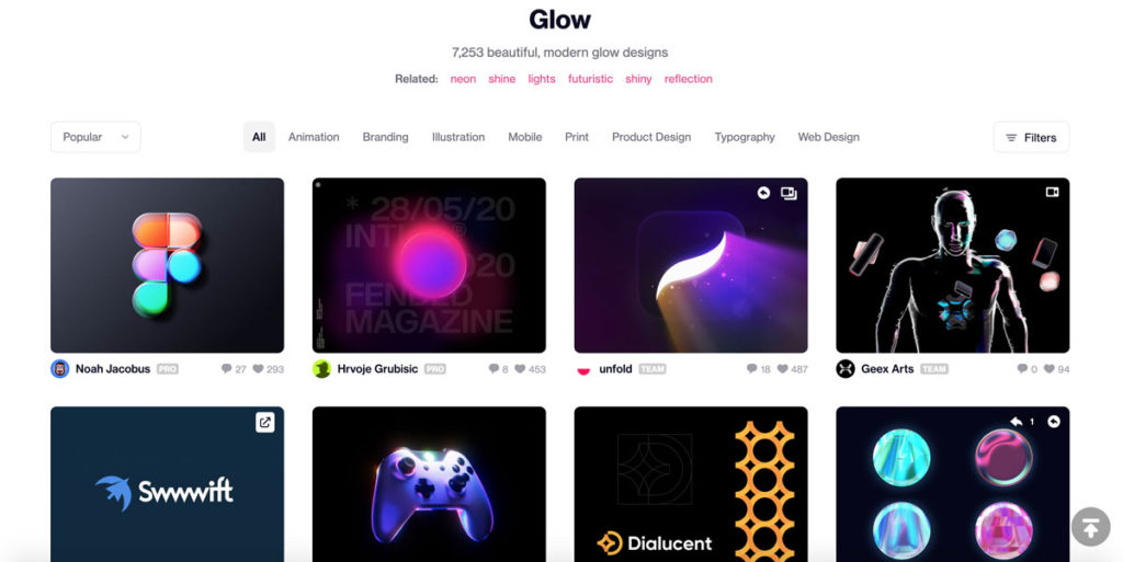
クリエイティブでは、テクノやサイバーパンクのネオン街に出てきそうな世界観のもので、特にDribbbleの海外のサイトで見かけるデザインが、Glow(グロー)です。
WEBサイトでの実装では、奥行きや立体感が自然と出やすいものなので、ボタンであった場合、hover や active のアクションが単調なものだと、いかにも貧弱なものになりやすいデザインです。
その為、CSSで調整する必要がありますが、使いこなすことでその世界観を表現できます。
そこで今回は、HTMLとCSSのコピペでできるグローデザインのボタン10個についてご紹介します。
目次
じんわり光るボタン
コードを表示する
HTML
<a href="#" class="btn-glow btn-hover-shine">光るボタン</a>
CSS
/* BUTTON GLOW */
.btn-glow {
    color: #fff !important;
    display: inline-block;
    background: rgb(138,97,248);
    background: -moz-linear-gradient(left, rgba(138,97,248,1) 0%, rgba(236,95,231,1) 100%);
    background: -webkit-linear-gradient(left, rgba(138,97,248,1) 0%,rgba(236,95,231,1) 100%);
    background: linear-gradient(to right, rgba(138,97,248,1) 0%,rgba(236,95,231,1) 100%);
    filter: progid:DXImageTransform.Microsoft.gradient( startColorstr='#8a61f8', endColorstr='#ec5fe7',GradientType=1 );
    border: none;
    text-align: center;
    font-weight: bold;
    font-size: 16px;
    line-height: 56px;
    letter-spacing: 0.07em;
    text-decoration: none !important;
    text-transform: uppercase;
    padding: 0 30px;
    transition: 0.3s;
    -webkit-transition: 0.3s;
    box-shadow: none;
    animation: glow 3s infinite;
    animation-timing-function: ease-out;
    position: relative;
    border-radius: 50px;
    }
.btn-glow:hover {
    box-shadow: 0 0 0 10px #3daaa200;
    transition: .8s;
    -webkit-transition: .8s;
    }
@keyframes glow{
      0% { box-shadow: 0 0 20px #8b61f844; text-shadow:  0 0 0px #fff; }
      40% { box-shadow: 0 0 100px #8b61f8ee; text-shadow:  0 0 20px #fff;}
      100% { box-shadow: 0 0 20px #8b61f844; text-shadow:  0 0 1px #fff; }
    }
.btn-hover-shine {
    position: relative;
    }
.btn-hover-shine:after {
    content: '';
    position: absolute;
    display: block;
    top: 0;
    height: 100%;
    right: 80%;
    width: 1px;
    background-color: #ffffff00;
    box-shadow: 0 0 20px #ffd2fe00, 0 0 10px #ffd2fe00, 0 0 5px #ffd2fe00, 0 0 2px #ffd2fe00;
    opacity: 1;
    }
.btn-hover-shine:hover:after {
    right: 2%;
    background-color: #ffffffff;
    box-shadow: 0 0 30px #ffd2feff, 0 0 15px #ffd2feff, 0 0 7px #ffd2feff, 0 0 3px #ffd2feff;
    opacity: 0;
    transition: 0.6s;
    -webkit-transition: 0.6s;
    }
ネオン風ボタン
コードを表示する
HTML
<a href="#" class="btn-neon">ネオン風ボタン</a>
CSS
/* ネオン */
.btn-neon {
    border: 2px solid #404040;
    box-shadow: none;
    color: #565656;
    text-shadow: 0 0 0px transparent;
    font-size: 16px;
    transition: .2s;
    -webkit-transition: .2s;
    padding: 15px 30px;
    line-height: 40px;
    margin: 0;
    border-radius: 0;
    cursor: pointer;
    border-radius: 50px;
}
.btn-neon:hover {
   border: 2px solid #d615c6;
   color: #d615c6;
   text-shadow: 0 0 4px #d615c6;
   box-shadow: inset 0 0 6px #d615c6,  0 0 6px #d615c6;
}
赤いグローボタン
コードを表示する
HTML
<a href="#" class="glowbt">ネオン風ボタン</a>
CSS
/* 赤いグロー */

.glowbt {
  position:relative;
  background:#f20e52;
  border:none;
  color:white;
  font-size:1em;
  font-family: 'Roboto', sans-serif;
  padding:12px 24px;
  border-radius:999px;
  cursor:pointer;
  outline:none;
  text-shadow:0 1px 2px rgba(0,0,0,0.5);
  box-shadow: 0 2px 8px -1px rgb(200 200 200 / 50%), 0 0 12px #f20e52;
  transition:box-shadow 0.2s ease-in-out;
  text-decoration:none;
}
.glowbt:hover, .glowbt:focus {
  box-shadow:0 2px 8px -1px rgba(100,100,100,0.5),
             0 0 16px 4px #f20e52,
             0 0 6px 2px #f20e52;
}
キラキラするグローボタン
コードを表示する
HTML
<a href="#" class="glowbt">ネオン風ボタン</a>
CSS
/* キラキラのグロー */

.glowflash {
  position: relative;
  animate: 0.5s;
  transition: 0.5s;
  height: 60px;
  text-align: center;
  line-height: 60px;
  color: #fff;
  text-decoration: none;
  box-sizing: border-box;
  background: linear-gradient(90deg, #03a9f4, #f441a5, #ffeb3b, #03a9f4);
  background-size: 400%;
  border-radius: 30px;
  z-index: 1;
  padding: 15px 30px;
}

.glowflash:hover {
  animation: animate 8s linear infinite;
  animate: 0.5s;
  transition: 0.5s;
}

@keyframes animate {
  0% {
    background-position: 0%;
  }
  100% {
    background-position: 400%;
  }
}

.glowflash:before {
  animate: 0.5s;
  transition: 0.5s;
  content: '';
  position: absolute;
  top: -5px;
  left: -5px;
  right: -5px;
  bottom: -5px;
  z-index: -1;
  background: linear-gradient(90deg, #03a9f4, #f441a5, #ffeb3b, #03a9f4);
  background-size: 400%;
  border-radius: 40px;
  opacity: 0;
  transition: 0.5s;

}

.glowflash:hover:before {
  filter: blur(20px);
  opacity: 1;
  animation: animate 8s linear infinite;
  animate: 0.5s;
  transition: 0.5s;
}
青から赤に変わるグローボタン
コードを表示する
HTML
<a href="#" class="pushglow">青から赤のボタン</a>
CSS
/* 青→赤のグロー */

.pushglow {
  height: 50px;
    background: #6bb6ff;
    border-radius: 100px;
    box-shadow: 0 5px 0px #4f96f6, 0 10px 100px #4f96f6;
    position: relative;
    transition: all .5s;
    padding: 15px 30px;
    color: #FFF;
}

.pushglow:hover{
  background:#FF2F2F;
  box-shadow: 0 5px 0px #B73434,0 7px 30px #FF2F2F;
}

.pushglow:active{
  background:#FF8282;
  box-shadow: 0 0px 10px #FF8282;
  box-shadow: 0 5px 0px #CC6262,0 4px 10px #FF8282;
}
青いグラデーションのグローボタン
コードを表示する
HTML
<a href="#" class="blueglow">青から赤のボタン</a>
CSS
/* グラデーションのグロー */

.blueglow {
  border-radius:100px;
  position: relative;
  padding: 15px 30px;
  background: linear-gradient(-45deg, rgba(87, 225, 181, 1) 0%, rgba(0, 63, 255, 1) 100%);
  box-shadow: 0 5px 20px rgba(0, 63, 255, .5);
  -webkit-transition: 0.5s ease-in-out;
  transition: 0.5s ease-in-out;
    color: #FFF;
}

.blueglow:hover{
  box-shadow: 0 5px 10px rgba(0, 63, 255, .5);
  opacity:0.9;
}
水色のグローボタン
コードを表示する
HTML
<a href="#" class="BlueGl">水色のグローボタン</a>
CSS
/* 水色のグロー */

.BlueGl{
  transition: 0.3s all ease-in-out;
  padding: 15px 30px;
  color: rgba(255, 255, 255, 0.7);
  font-weight: 600;
  background: linear-gradient(60deg, #00b4ff, #61caf6);
  border-radius: 50px;
  box-shadow: rgba(97, 202, 246, 0.4) 0px 8px 30px;
}
.BlueGl:hover{
  color: rgba(255, 255, 255, 1);
  background: linear-gradient(60deg, #00b3fe, #00b4ff);
  box-shadow: rgba(97, 202, 246, 0.8) 0px 15px 30px;
}
水色のネガティブグローボタン
コードを表示する
HTML
<a href="#" class="BlueGlrev">水色のボタン</a>
CSS
/* 逆水色のグロー */

.BlueGlrev{
  transition: 0.3s all ease-in-out;
  padding: 15px 30px;
  color: #00b4ff;
  text-decoration: none;
  border: 2px solid #00b4ff;
  background: rgba(255, 255, 255, 0.3);
  border-radius: 50px;
  box-shadow: inset rgba(97, 202, 246, 0.7) 0px 0px 10px, rgba(97, 202, 246, 0.3) 0px 11px 20px 3px;
}
.BlueGlrev:hover{
  color: #ffffff;
  background: linear-gradient(60deg, #00b3fe, #00b4ff);
  box-shadow: rgba(97, 202, 246, 0.8) 0px 15px 30px;
}
シャドウが大きくなるグローボタン
コードを表示する
HTML
<a href="#" class="ver_glow">グローボタン</a>
CSS
/* Button Effect*/
.ver_glow {
  border-radius: 50px;
  padding: 15px 30px;
  text-transform: uppercase;
  background-color: #6bb6ff;
  color: white;
  border: none;
  box-shadow: 0 2px 8px -1px rgb(200 200 200 / 50%), 0 0 12px #c8e4ff;
  transition:box-shadow 0.2s ease-in-out;
}

.ver_glow:hover {
  background-color: #4fb3ff;
  box-shadow: 0 0 10px #2196f3,
    0 0 8px #2196f3,
    0 0 110px #2196f3;
  color: white;
  border: none;
}
紫のグローボタン
コードを表示する
HTML
<a href="#" class="ver_glow">グローボタン</a>
CSS
/* Button Effect*/
.ver_glow {
  border-radius: 50px;
  padding: 15px 30px;
  text-transform: uppercase;
  background-color: #6bb6ff;
  color: white;
  border: none;
  box-shadow: 0 2px 8px -1px rgb(200 200 200 / 50%), 0 0 12px #c8e4ff;
  transition:box-shadow 0.2s ease-in-out;
}

.ver_glow:hover {
  background-color: #4fb3ff;
  box-shadow: 0 0 10px #2196f3,
    0 0 8px #2196f3,
    0 0 110px #2196f3;
  color: white;
  border: none;
}