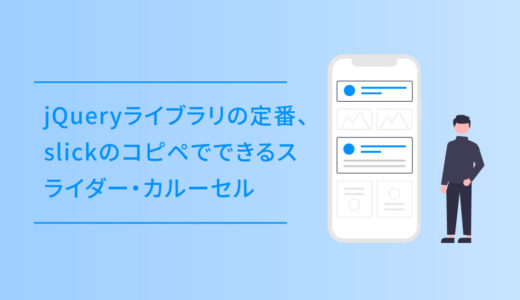
当サイトでも使用しているSANGOのテーマには、イケてるボタンが簡単に多数使えるようになっていますが、アニメーション付きのダウンロードボタンを6つ作りました。
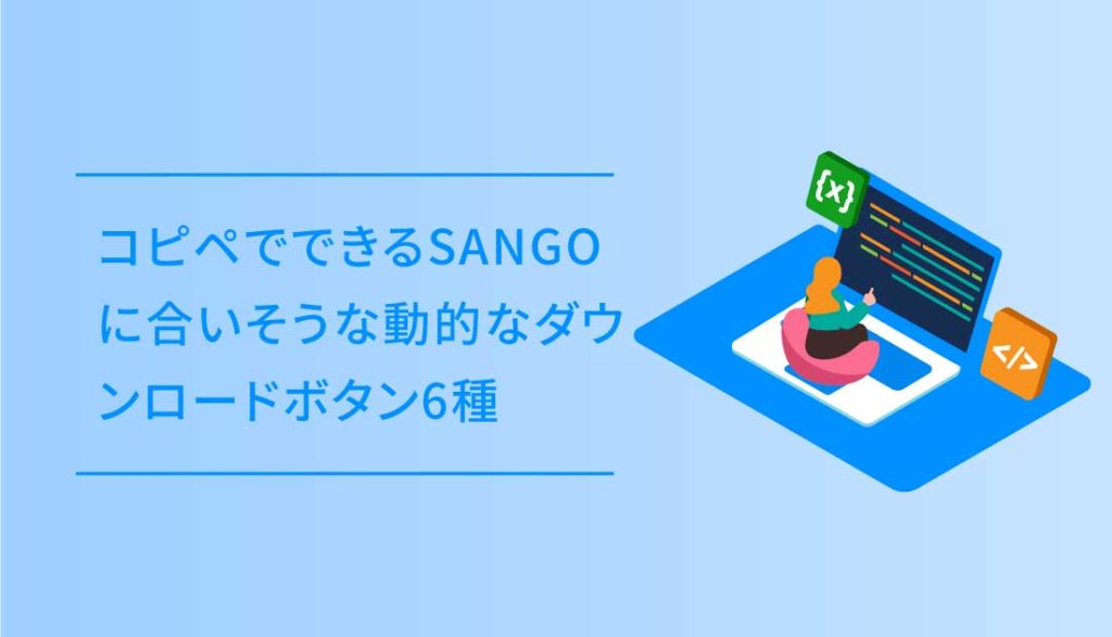
今回は、コピペでできるSANGOに合いそうな動的なダウンロードボタン6種をご紹介します。
6種のボタンは全て、HTML+CSS+JSのコピペでできるように作っています。
ダウンロードボタン
ダウンロードボタンは、クリックで動きがスタートし一定時間ダウンロード中的なアニメーションの後、表示が切り替わりファイルを開ける使用です。
ボタンは、色合いとサイズ違いの全部で6種類です。
使い方とコピペ用コード
使い方は簡単で、以下のように使いたいボタンのHTMLを <div class=”container”> 〜使いたいボタン〜 </div> で置き、CSSとJSのコードを貼り付けて完了です。
HTML
<div class="container">
<a href="" class="button sango">
        <ul>
            <li><i class="far fa-file-archive"></i> ダウンロード</li>
            <li>ダウンロード中</li>
            <li>ファイルを開く</li>
        </ul>
        <div>
            <svg viewBox="0 0 24 24"></svg>
        </div>
    </a>
</div>
<ul>の中の<li>要素の文言は、標準で Download 等英語表記で入れていますが、これらの文言は変更可能です。
文言に <a>〜〜</a> タグでリンクも持たせることが可能で、それ以外にもfontawesome でアイコン表記もできます。
コピペ用コード一式
コードを表示する
HTML
<div class="container">
<a href="" class="button">
<ul>
<li>Download</li>
<li>Downloading</li>
<li>Open File</li>
</ul>
<div>
<svg viewBox="0 0 24 24"></svg>
</div>
</a>
<a href="" class="button dark-single">
<div>
<svg viewBox="0 0 24 24"></svg>
</div>
</a>
<div></div>
<a href="" class="button white-single">
<div>
<svg viewBox="0 0 24 24"></svg>
</div>
</a>
<a href="" class="button dark">
<ul>
<li>Download</li>
<li>Downloading</li>
<li>Open File</li>
</ul>
<div>
<svg viewBox="0 0 24 24"></svg>
</div>
</a>
<div></div>
<a href="" class="button sango">
<ul>
<li>Download</li>
<li>Downloading</li>
<li>Open File</li>
</ul>
<div>
<svg viewBox="0 0 24 24"></svg>
</div>
</a>
<a href="" class="button sango-single">
<div>
<svg viewBox="0 0 24 24"></svg>
</div>
</a>
</div>
CSS
.button.dark-single {
  --background: none;
  --rectangle: #242836;
  --success: #4BC793;
}

.button.sango-single {
  --background: none;
  --rectangle: #6bb6ff;
  --success: #0090ff;
}

.button.white-single {
  --background: none;
  --rectangle: #F5F9FF;
  --arrow: #275efe;
  --success: #275efe;
  --shadow: rgba(10, 22, 50, .1);
}
.button.dark {
  --background: #242836;
  --rectangle: #1C212E;
  --arrow: #F5F9FF;
  --text: #F5F9FF;
  --success: #2F3545;
}

.button {
  --background: #275efe;
  --rectangle: #184fee;
  --success: #4672f1;
  --text: #FFFFFF;
  --arrow: #fff;
  --checkmark: #fff;
  --shadow: rgba(10, 22, 50, .24);
  display: flex;
  overflow: hidden;
  text-decoration: none;
  -webkit-mask-image: -webkit-radial-gradient(white, black);
  background: var(--background);
  border-radius: 8px;
  box-shadow: 0 2px 8px -1px var(--shadow);
  transition: transform 0.2s ease, box-shadow 0.2s ease;
}

.button.sango {
  --background: #c8e4ff;
  --rectangle: #6bb6ff;
  --success: #0090ff;
  --text: #0090ff;
  --arrow: #fff;
  --checkmark: #fff;
  --shadow: rgba(10, 22, 50, .24);
  display: flex;
  overflow: hidden;
  text-decoration: none;
  -webkit-mask-image: -webkit-radial-gradient(white, black);
  background: var(--background);
  border-radius: 8px;
  box-shadow: 0 2px 8px -1px var(--shadow);
  transition: transform 0.2s ease, box-shadow 0.2s ease;
}

.button:active {
  transform: scale(0.95);
  box-shadow: 0 1px 4px -1px var(--shadow);
}
.button ul {
  margin: 0;
  padding: 16px 40px;
  list-style: none;
  text-align: center;
  position: relative;
  backface-visibility: hidden;
  font-size: 16px;
  font-weight: 500;
  line-height: 28px;
  color: var(--text);
  border: none;
}
.button ul li:not(:first-child) {
  top: 16px;
  left: 0;
  right: 0;
  position: absolute;
}
.button ul li:nth-child(2) {
  top: 76px;
}
.button ul li:nth-child(3) {
  top: 136px;
}
.button > div {
  position: relative;
  width: 60px;
  height: 60px;
  background: var(--rectangle);
}
.button > div:before, .button > div:after {
  content: "";
  display: block;
  position: absolute;
}
.button > div:before {
  border-radius: 1px;
  width: 2px;
  top: 50%;
  left: 50%;
  height: 17px;
  margin: -9px 0 0 -1px;
  background: var(--arrow);
}
.button > div:after {
  width: 60px;
  height: 60px;
  transform-origin: 50% 0;
  border-radius: 0 0 80% 80%;
  background: var(--success);
  top: 0;
  left: 0;
  transform: scaleY(0);
}
.button > div svg {
  display: block;
  position: absolute;
  width: 20px;
  height: 20px;
  left: 50%;
  top: 50%;
  margin: -9px 0 0 -10px;
  fill: none;
  z-index: 1;
  stroke-width: 2px;
  stroke: var(--arrow);
  stroke-linecap: round;
  stroke-linejoin: round;
}
.button.loading ul {
  animation: text calc(var(--duration) * 1ms) linear forwards calc(var(--duration) * .065ms);
}
.button.loading > div:before {
  animation: line calc(var(--duration) * 1ms) linear forwards calc(var(--duration) * .065ms);
}
.button.loading > div:after {
  animation: background calc(var(--duration) * 1ms) linear forwards calc(var(--duration) * .065ms);
}
.button.loading > div svg {
  animation: svg calc(var(--duration) * 1ms) linear forwards calc(var(--duration) * .065ms);
}

@keyframes text {
  10%, 85% {
    transform: translateY(-100%);
  }
  95%, 100% {
    transform: translateY(-200%);
  }
}
@keyframes line {
  5%, 10% {
    transform: translateY(-30px);
  }
  40% {
    transform: translateY(-20px);
  }
  65% {
    transform: translateY(0);
  }
  75%, 100% {
    transform: translateY(30px);
  }
}
@keyframes svg {
  0%, 20% {
    stroke-dasharray: 0;
    stroke-dashoffset: 0;
  }
  21%, 89% {
    stroke-dasharray: 26px;
    stroke-dashoffset: 26px;
    stroke-width: 3px;
    margin: -10px 0 0 -10px;
    stroke: var(--checkmark);
  }
  100% {
    stroke-dasharray: 26px;
    stroke-dashoffset: 0;
    margin: -10px 0 0 -10px;
    stroke: var(--checkmark);
  }
  12% {
    opacity: 1;
  }
  20%, 89% {
    opacity: 0;
  }
  90%, 100% {
    opacity: 1;
  }
}
@keyframes background {
  10% {
    transform: scaleY(0);
  }
  40% {
    transform: scaleY(0.15);
  }
  65% {
    transform: scaleY(0.5);
    border-radius: 0 0 50% 50%;
  }
  75% {
    border-radius: 0 0 50% 50%;
  }
  90%, 100% {
    border-radius: 0;
  }
  75%, 100% {
    transform: scaleY(1);
  }
}
html {
  box-sizing: border-box;
  -webkit-font-smoothing: antialiased;
}

* {
  box-sizing: inherit;
}
*:before, *:after {
  box-sizing: inherit;
}

.container li {
  padding: 0;
}

.container {
  display: flex;
  flex-wrap: wrap;
  justify-content: center;
}
.container > div {
  flex-basis: 100%;
  width: 0;
}
.container .button {
  margin: 16px;
}
@media (max-width: 400px) {
.container .button {
    margin: 12px;
  }
}
JS
document.querySelectorAll('.button').forEach(button => {

    let duration = 3000,
        svg = button.querySelector('svg'),
        svgPath = new Proxy({
            y: null,
            smoothing: null
        }, {
            set(target, key, value) {
                target[key] = value;
                if(target.y !== null && target.smoothing !== null) {
                    svg.innerHTML = getPath(target.y, target.smoothing, null);
                }
                return true;
            },
            get(target, key) {
                return target[key];
            }
        });

    button.style.setProperty('--duration', duration);

    svgPath.y = 20;
    svgPath.smoothing = 0;

    button.addEventListener('click', e => {

        e.preventDefault();

        if(!button.classList.contains('loading')) {

            button.classList.add('loading');

            gsap.to(svgPath, {
                smoothing: .3,
                duration: duration * .065 / 1000
            });

            gsap.to(svgPath, {
                y: 12,
                duration: duration * .265 / 1000,
                delay: duration * .065 / 1000,
                ease: Elastic.easeOut.config(1.12, .4)
            });

            setTimeout(() => {
                svg.innerHTML = getPath(0, 0, [
                    [3, 14],
                    [8, 19],
                    [21, 6]
                ]);
            }, duration / 2);

        }

    });

});

function getPoint(point, i, a, smoothing) {
    let cp = (current, previous, next, reverse) => {
            let p = previous || current,
                n = next || current,
                o = {
                    length: Math.sqrt(Math.pow(n[0] - p[0], 2) + Math.pow(n[1] - p[1], 2)),
                    angle: Math.atan2(n[1] - p[1], n[0] - p[0])
                },
                angle = o.angle + (reverse ? Math.PI : 0),
                length = o.length * smoothing;
            return [current[0] + Math.cos(angle) * length, current[1] + Math.sin(angle) * length];
        },
        cps = cp(a[i - 1], a[i - 2], point, false),
        cpe = cp(point, a[i - 1], a[i + 1], true);
    return `C ${cps[0]},${cps[1]} ${cpe[0]},${cpe[1]} ${point[0]},${point[1]}`;
}

function getPath(update, smoothing, pointsNew) {
    let points = pointsNew ? pointsNew : [
            [4, 12],
            [12, update],
            [20, 12]
        ],
        d = points.reduce((acc, point, i, a) => i === 0 ? `M ${point[0]},${point[1]}` : `${acc} ${getPoint(point, i, a, smoothing)}`, '');
    return `<path d="${d}" />`;
}