
よくWebアプリで見かける、ページ切り替え時にボールが跳ねる「バウンスボール」を使って表示させるものをJavaScriptで作りました。

ボールが上下にポヨンポヨン跳ねるやつです。
ページの遷移はいろんなパターンがありますが、少しのアニメーションでサイトがリッチに見えるようにもなるので、参考にしてみてください。
setTimeout()
JavaScriptの setTimeout() は、タイマーを設定するメソッドです。
setTimeout(function(){
    element.style.display = "none";
}, 1500);メソッドの中でタイマーの秒数をミリ秒の単位で指定をして、時間切れになると関数を実行させます。
個人的にフェードイン・フェードアウトで使うことが多いメソッドです。
この記事では、このメソッドを使ってページ遷移のアニメーションを作っています。
バウンスボール表示のサンプル
バウンスボールは、以下のようにボールが床から跳ねてるようにバウンドしているようなアニメーションです。
上記のサンプルは、バウンスボールをずっと再生させたアニメーションです。
この記事では、このバウンスボールを主にCSSで作り、JavaScriptで「ページローディング時」に表示させていて、以下のように表示されます。
表示の時を見逃してしまった場合は、こちらの「ページ更新」のボタンでリロードしてみてください。
実装の手順と方法

コードの解説の前に、ざっくりとした実装の手順と方法について解説します。
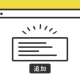
表示させたいページのHTMLに記述します。
<div id="page-loading" class="fadein">
  <div class="three-balls">
    <div class="ball ball1"></div>
    <div class="ball ball2"></div>
    <div class="ball ball3"></div>
  </div>
</div>場所は基本どこでも大丈夫ですが、できればHTMLの<body>〜</body> の先頭に近い方が構文的にいいです。
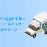
次に、JavaScriptのコードをページに記述します。
コードは <body>〜</body> で、</body> の閉じタグ(クロージングタグ)の前に記述しましょう。
// bodyタグを取得
const documentBody = document.querySelector('body');
var newElement = document.getElementById("page-loading");

// 2.5秒経ったらオーバーレイ非表示
setTimeout(function(){
    newElement.style.display = "none";
  }, 2500);

// ページ遷移時にフェードアウト
window.addEventListener("beforeunload", () => {
  documentBody.classList.add('fadeout');
  setTimeout(function(){
    documentBody.style.display = "none";
  }, 1000);
}, false);最後に、CSSを記述します。
#page-loading {
  position: fixed;
  top: 0;
  left: 0;
  bottom: 0;
  right: 0;
  z-index: 999;
  background-color: #FFF;
  animation : fadeInBounce 2.5s;
  animation-fill-mode: both;
  pointer-events: none;
}
#bounceball {
    position: relative;
    display: block;
    padding: 100px 0 40px;
}

.three-balls {
  margin: 0 auto;
  width: 70px;
  text-align: center;
  position: absolute;
  left: 0;
  right: 0;
  top: 45%;
}

.three-balls .ball {
  position: relative;
  width: 15px;
  height: 15px;
  border-radius: 50%;
  display: inline-block;
  -webkit-animation: bouncedelay 2.0s infinite cubic-bezier(.62, .28, .23, .99) both;
  animation: bouncedelay 2.0s infinite cubic-bezier(.62, .28, .23, .99) both;
}

.three-balls .ball1 {
  -webkit-animation-delay: -.16s;
  animation-delay: -.16s;
}

.three-balls .ball2 {
  -webkit-animation-delay: -.08s;
  animation-delay: -.08s;
}

@keyframes bouncedelay {
  0% {
    bottom: 0;
    background-color: #03A9F4;
  }
  16.66% {
    bottom: 40px;
    background-color: #FB6542;
  }
  33.33% {
    bottom: 0px;
    background-color: #FB6542;
  }
  50% {
    bottom: 40px;
    background-color: #FFBB00;
  }
  66.66% {
    bottom: 0px;
    background-color: #FFBB00;
  }
  83.33% {
    bottom: 40px;
    background-color: #03A9F4;
  }
  100% {
    bottom: 0;
    background-color: #03A9F4;
  }
}

@-webkit-keyframes bouncedelay {
  0% {
    bottom: 0;
    background-color: #03A9F4;
  }
  16.66% {
    bottom: 40px;
    background-color: #FB6542;
  }
  33.33% {
    bottom: 0px;
    background-color: #FB6542;
  }
  50% {
    bottom: 40px;
    background-color: #FFBB00;
  }
  66.66% {
    bottom: 0px;
    background-color: #FFBB00;
  }
  83.33% {
    bottom: 40px;
    background-color: #03A9F4;
  }
  100% {
    bottom: 0;
    background-color: #03A9F4;
  }
}

.fadeout {
  animation : fadeOut 1s;
  animation-fill-mode: both;
}
@keyframes fadeOut {
  0% {
    opacity: 1;
  }
  100% {
    opacity: 0;
  }
}

@keyframes fadeInBounce {
  0% {
    opacity: 1;
  }
  100% {
    opacity: 0;
  }
}手順はこれで完了です。
ざっくりとしたコードの解説
コードはHTML・JavaScript・CSSの3種類です。ざっくりですが、順に解説していきます。
HTML
HTMLは、「page-loading」というid名で親要素を作り、その中にバウンスボールを「three-balls」のclass名で括り、ボール一個一個を「ball」で作ります。
<div id="page-loading" class="fadein">
  <div class="three-balls">
    <div class="ball ball1"></div>
    <div class="ball ball2"></div>
    <div class="ball ball3"></div>
  </div>
</div>
ローディング時のオーバーレイとして表示させるので、設置したいHTMLのなるべく冒頭の方に記述するようにしましょう。
JavaScript
JavaScriptは、バウンスボールを表示させる条件と、ページから離脱するときの記述です。
// bodyタグを取得
const documentBody = document.querySelector('body');
var newElement = document.getElementById("page-loading");

// 2.5秒経ったらオーバーレイ非表示
setTimeout(function(){
    newElement.style.display = "none";
  }, 2500);

// ページ遷移時にフェードアウト
window.addEventListener("beforeunload", () => {
  documentBody.classList.add('fadeout');
  setTimeout(function(){
    documentBody.style.display = "none";
  }, 1000);
}, false);
アニメーションは主にCSSで記述していきますが、要素の表示・非表示はJavaScriptの setTimeout でいじっていき、CSSのタイミングと合わせるように秒数を指定します。
CSS
CSSでは、ローディング時に白く画面を覆い尽くすオーバーレイと、そこに表示されるバウンスボールを作ります。
#page-loading {
  position: fixed;
  top: 0;
  left: 0;
  bottom: 0;
  right: 0;
  z-index: 999;
  background-color: #FFF;
  animation : fadeInBounce 2.5s;
  animation-fill-mode: both;
  pointer-events: none;
}
#bounceball {
    position: relative;
    display: block;
    padding: 100px 0 40px;
}

.three-balls {
  margin: 0 auto;
  width: 70px;
  text-align: center;
  position: absolute;
  left: 0;
  right: 0;
  top: 45%;
}

.three-balls .ball {
  position: relative;
  width: 15px;
  height: 15px;
  border-radius: 50%;
  display: inline-block;
  -webkit-animation: bouncedelay 2.0s infinite cubic-bezier(.62, .28, .23, .99) both;
  animation: bouncedelay 2.0s infinite cubic-bezier(.62, .28, .23, .99) both;
}

.three-balls .ball1 {
  -webkit-animation-delay: -.16s;
  animation-delay: -.16s;
}

.three-balls .ball2 {
  -webkit-animation-delay: -.08s;
  animation-delay: -.08s;
}

@keyframes bouncedelay {
  0% {
    bottom: 0;
    background-color: #03A9F4;
  }
  16.66% {
    bottom: 40px;
    background-color: #FB6542;
  }
  33.33% {
    bottom: 0px;
    background-color: #FB6542;
  }
  50% {
    bottom: 40px;
    background-color: #FFBB00;
  }
  66.66% {
    bottom: 0px;
    background-color: #FFBB00;
  }
  83.33% {
    bottom: 40px;
    background-color: #03A9F4;
  }
  100% {
    bottom: 0;
    background-color: #03A9F4;
  }
}

@-webkit-keyframes bouncedelay {
  0% {
    bottom: 0;
    background-color: #03A9F4;
  }
  16.66% {
    bottom: 40px;
    background-color: #FB6542;
  }
  33.33% {
    bottom: 0px;
    background-color: #FB6542;
  }
  50% {
    bottom: 40px;
    background-color: #FFBB00;
  }
  66.66% {
    bottom: 0px;
    background-color: #FFBB00;
  }
  83.33% {
    bottom: 40px;
    background-color: #03A9F4;
  }
  100% {
    bottom: 0;
    background-color: #03A9F4;
  }
}

.fadeout {
  animation : fadeOut 1s;
  animation-fill-mode: both;
}
@keyframes fadeOut {
  0% {
    opacity: 1;
  }
  100% {
    opacity: 0;
  }
}

@keyframes fadeInBounce {
  0% {
    opacity: 1;
  }
  100% {
    opacity: 0;
  }
}アニメーションは、@keyframes でボールが跳ねる様子と、フェードイン・フェードアウトを作り、それぞれのclass名にアニメーションで定義していけば完成です。
さいごに

ページ遷移のアニメーションは、時間がかかるものだとユーザーにストレスになりますが、スムーズで適度なものであれば、見栄えも良くなるのでオススメです。
これ以外にも色々あるので、この記事を参考にしながらCSSのアニメーションと掛け合わせて自分好みのものを探してみてください。